
SVEA Solar: Brand Identity


May 2020
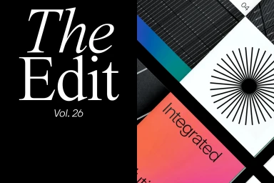
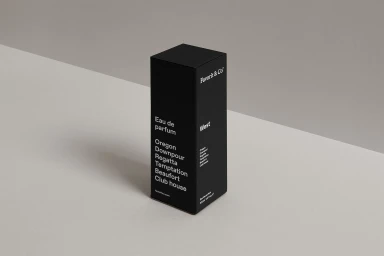
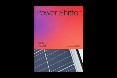
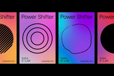
The brand identity overhaul for SVEA Solar moves beyond the utilitarian constraints of the renewable energy sector, opting instead for a bold, high-contrast aesthetic that feels distinctly editorial. Through a series of carefully composed design assets, the work leans into a vibrant color palette of neon gradients, pairing saturated purples, oranges, and pinks with the structured, industrial textures of photovoltaic cells. This interplay between the technical and the artistic serves to humanize a complex corporate offering, repositioning the brand as a forward-thinking player in green technology. The project utilizes a sophisticated approach to typography, where clean sans-serif layouts sit alongside elegant serif accents, creating a visual language that is both accessible and premium. By integrating UI illustration and structured grid-based layouts, the design team from Justified Studio, Y Wilson, Sould, makebardo, and Stefan Jandl successfully bridges the gap between commercial corporate identity and high-end graphic design. The result is a cohesive, modern visual system that feels as much at home in a lifestyle publication as it does in a boardroom. Each element, from the deliberate use of geometric icons to the precise, minimalist composition of supporting packaging collateral, underscores a commitment to clarity, precision, and the transformative power of sustainable design, effectively shifting the brand narrative into a space of contemporary relevance and visual authority.
Commercial, Clean, Horizontal


