
B-LA CONNECT: Brand Identity
Jun 2019
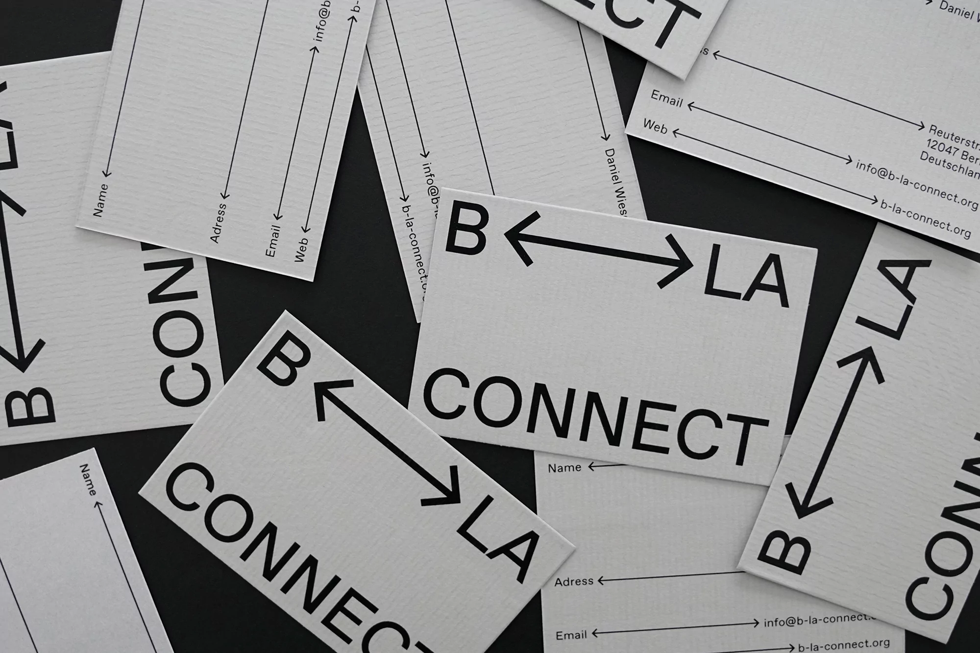
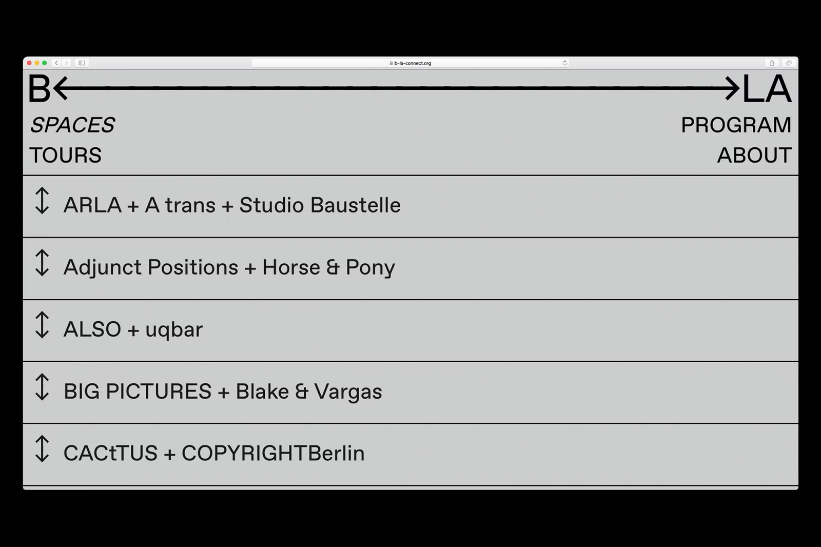
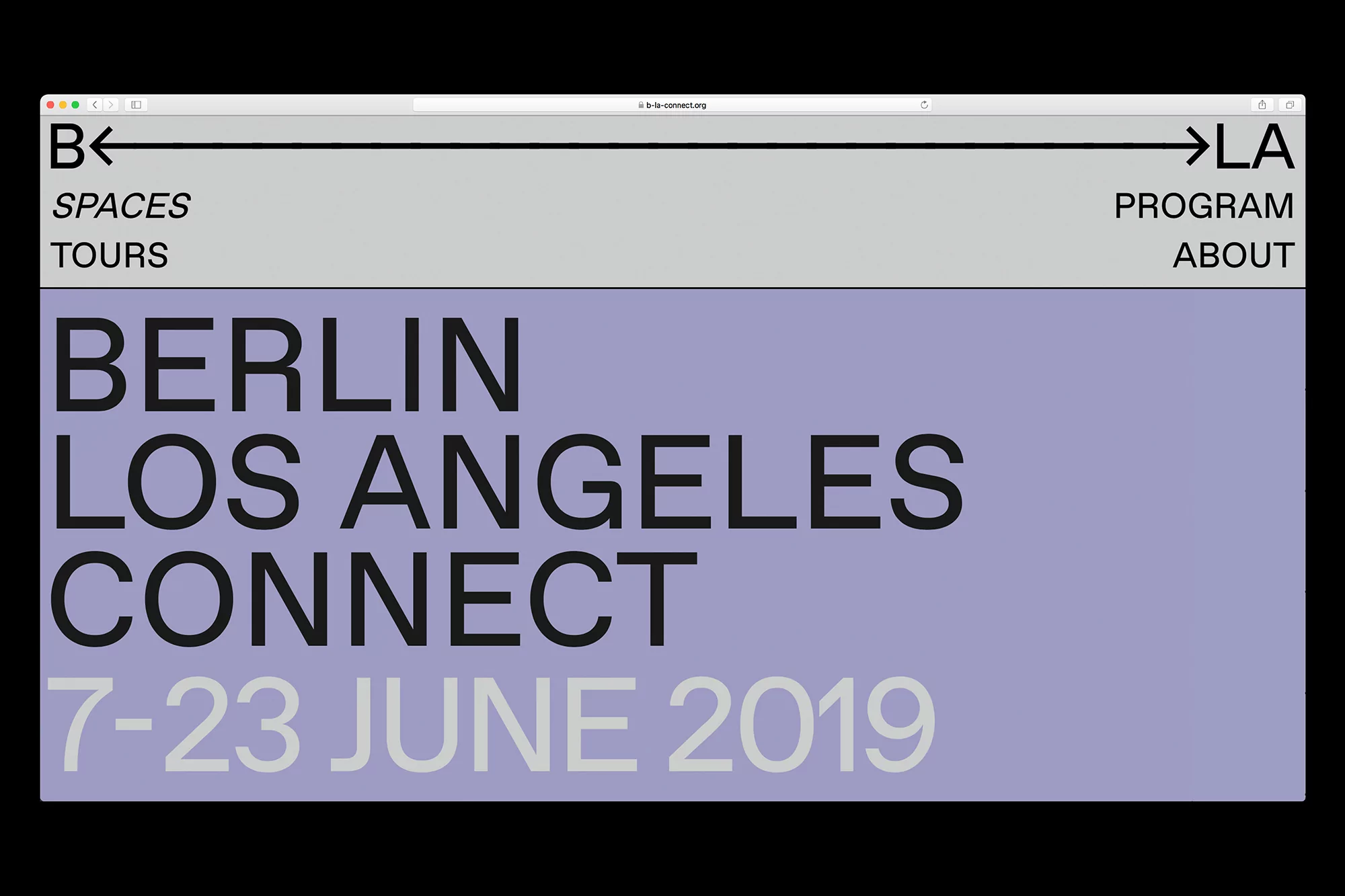
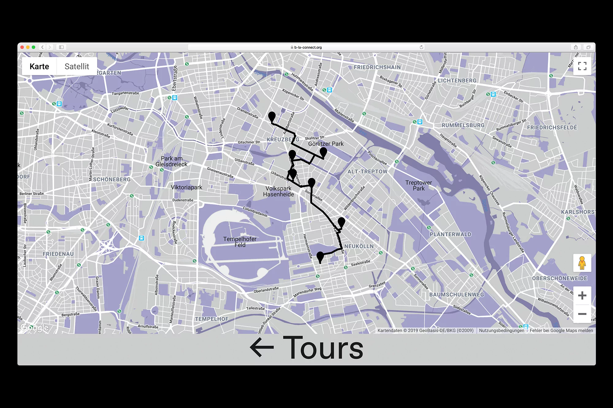
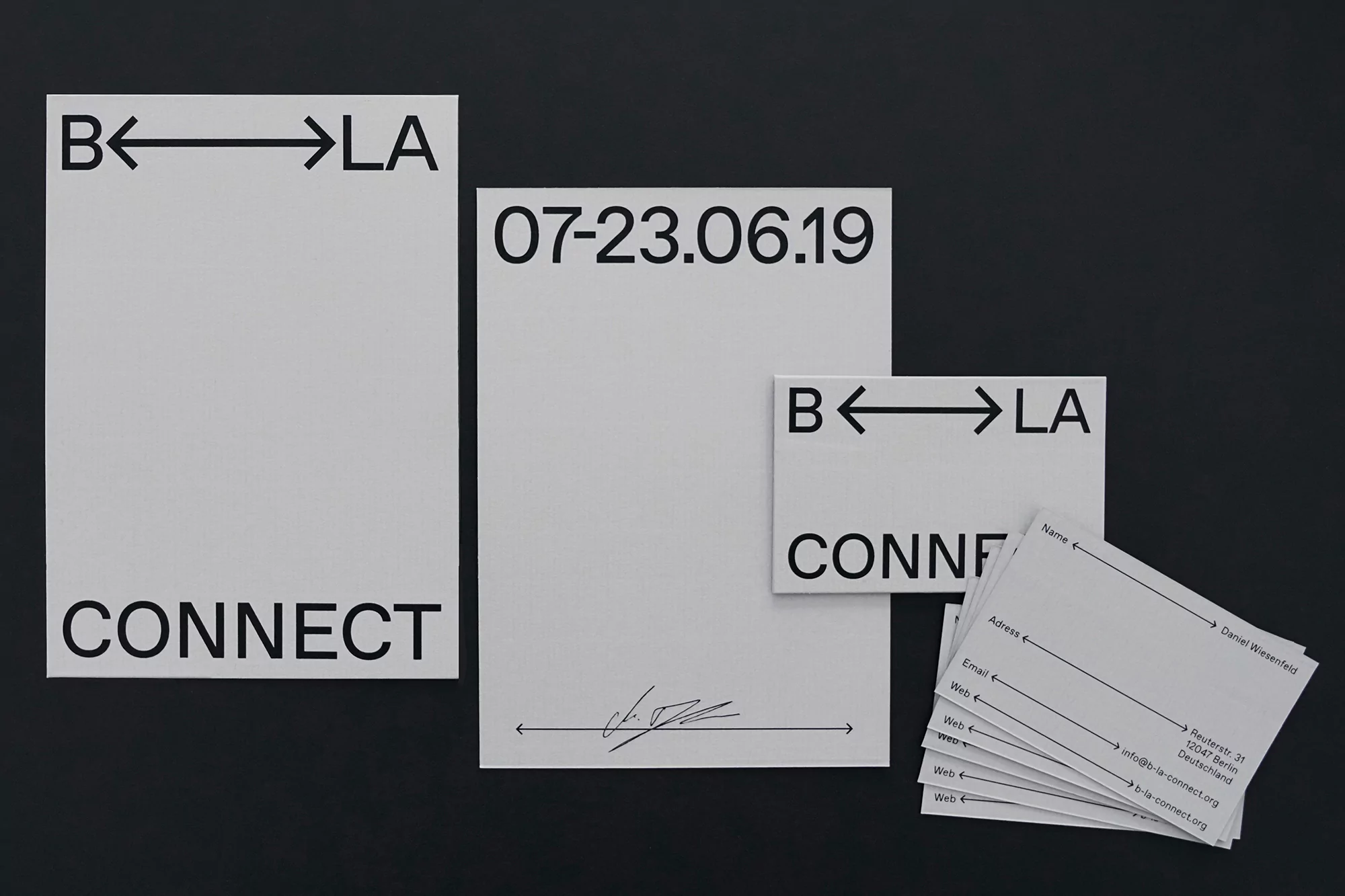
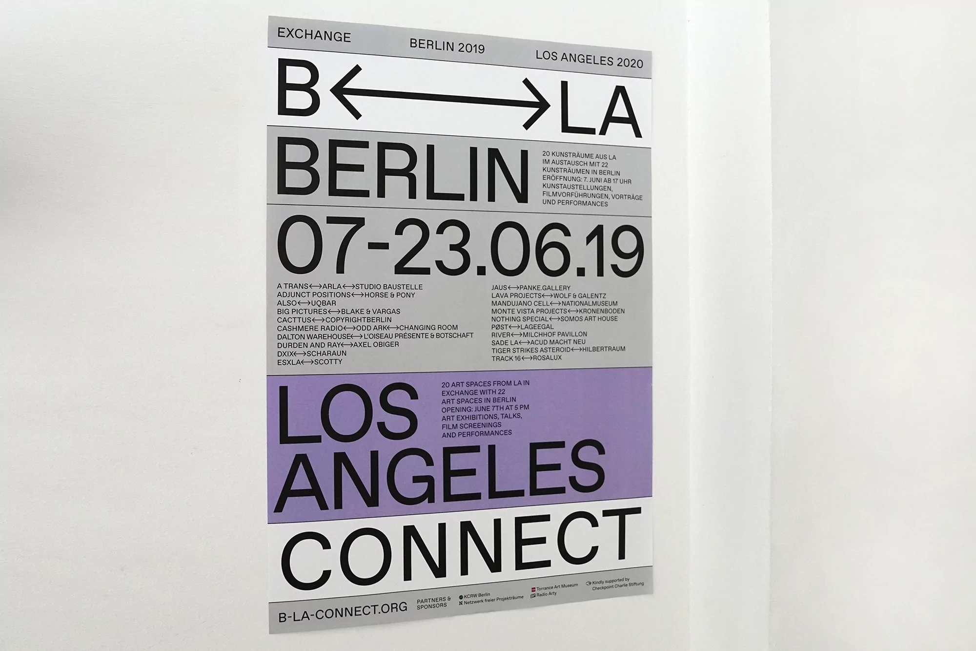
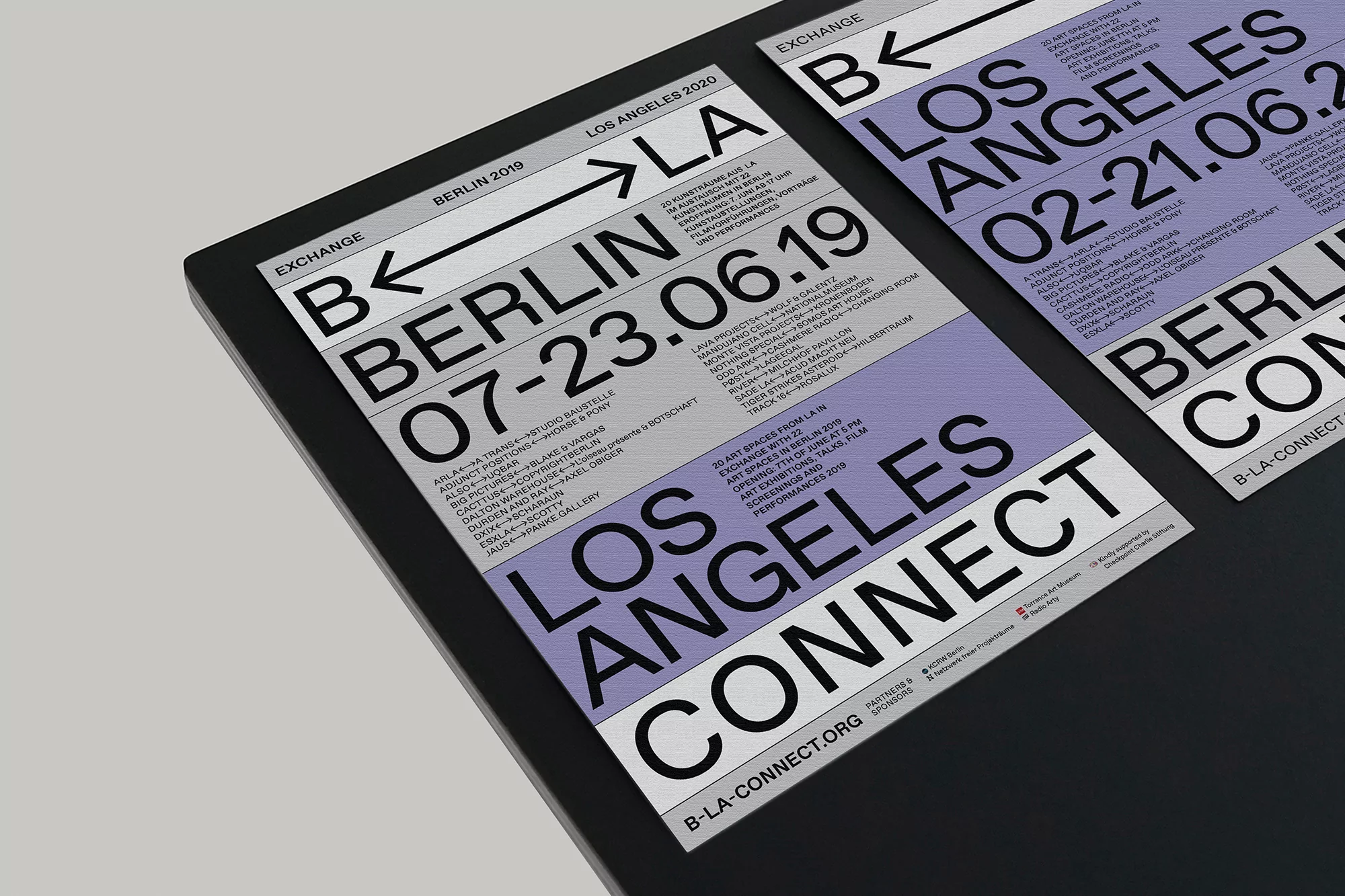
The brand identity for B-LA CONNECT serves as a masterclass in minimalist design, bridging the gap between high-level technology and the intimate nature of an international art exchange. Designed by Studio Last, the identity system effortlessly bridges the cultural distance between Berlin and Los Angeles through a sophisticated visual language that prioritizes clarity and institutional professionalism. The core of the branding centers on a distinct wordmark featuring bidirectional arrows, a recurring motif that serves as a kinetic link between the two cities. Across both digital and print collateral, the execution leans into a restricted palette of stark black, crisp white, and muted lavender, which allows the bold sans-serif typography to anchor the information hierarchy. By utilizing intentional whitespace and a structured grid, the team delivers a seamless aesthetic that feels equally at home on a digital map interface as it does on high-quality stationery or gallery-grade posters. This commercial project succeeds by avoiding decorative excess, instead relying on the functional elegance of UI illustration and clean graphic composition to communicate a complex program of events. The result is a cohesive, modern brand architecture that feels both authoritative and approachable, effectively positioning B-LA CONNECT as a refined, interconnected platform within the competitive global arts and technology landscape.
Horizontal, Minimalist, Commercial, Clean
Typography
Website / Web
