
Blake & Vargas: Brand Identity
Feb 2019
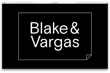
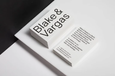
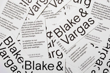
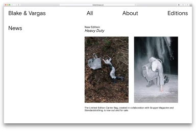
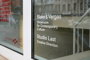
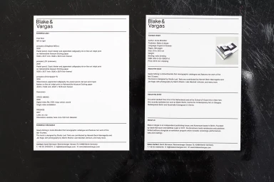
The visual identity for Berlin-based curatorial platform Blake & Vargas masterfully navigates the intersection of digital media and contemporary art, establishing a rigorous corporate language that feels both authoritative and approachable. Developed in collaboration with Studio Last, the branding project leans into a philosophy of editorial minimalism, prioritizing clarity and high-contrast typography to anchor the platform's diverse outputs, which range from limited-edition publishing to exhibition curation. The graphic system is defined by a bold, black-on-white sans-serif palette, utilizing a strict grid structure that translates seamlessly across physical collateral—such as thick-stock business cards and storefront signage—and a clean, functional web interface. Central to the aesthetic is the recurring motif of a square frame featuring subtle, folded-corner details, a graphic conceit that introduces a tactile, paper-like quality to digital assets. By blending high-key lighting in its printed application with the crisp, clean lines of its UI illustration, the identity functions less as a traditional logo and more as a flexible framework for the organization's institutional data. This cohesive design language effectively communicates the precision expected of a professional publishing house while retaining the open, airy sensibility required to showcase art and design, resulting in a project that serves as a masterclass in modern, monochromatic corporate communication.
Commercial, Minimalist, Horizontal, Clean
Typography
