
Arctic Paper: Brand Identity

Oct 2021
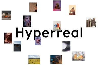
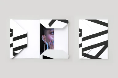
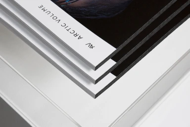
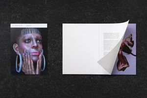
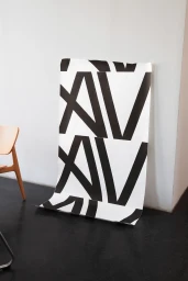
This brand identity project for Arctic Paper, developed by JUNO, translates the tactile precision of high-end paper stock into a cohesive digital and physical ecosystem. The design system leverages minimalist, clean aesthetics to emphasize the interplay between typography and high-key print finishes, utilizing sharp geometric lettermarks and bold monochromatic palettes across both editorial layouts and collateral materials. The project demonstrates versatility in presentation, ranging from interactive digital interface showcases to physical product applications. Key elements include custom paper folders and the Arctic Volume publication, which pair high-contrast portraiture with structured layouts. By employing techniques like screen print, motion graphics, and minimalist graphic design, the identity emphasizes the material quality and editorial potential of the product line.
Clean, Horizontal, Commercial
White Seamless


