
Arcadia Science: Brand Identity
Jun 2022
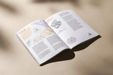
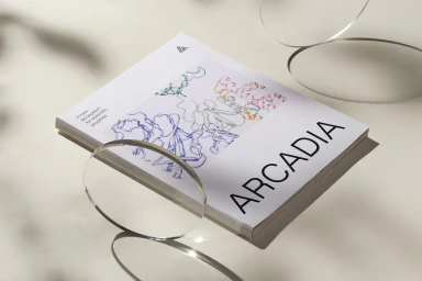
Arcadia Science establishes its market presence with a brand identity centered on clean editorial design and technical precision. The project spans both print and digital assets, grounding scientific research in a visual language of muted earth tones and fine-line biological illustrations. The execution relies on a minimalist aesthetic that bridges corporate and editorial formats. Graphic design by Play utilizes sharp vector line art and geometric typography to organize complex information, while the use of natural light and tactile textures in the still photography reinforces the brand's focus on innovation and organizational values. Motion pieces further extend this identity through smooth, precise animation. These digital touchpoints feature refined transitions and clear typography, maintaining the brand’s commitment to scientific progress through a cohesive design system.
Horizontal, Clean, Commercial, Minimalist
Typography
Solid Colour
Brand Film / Corporate Video
