
Associated creatives
Tags
Description
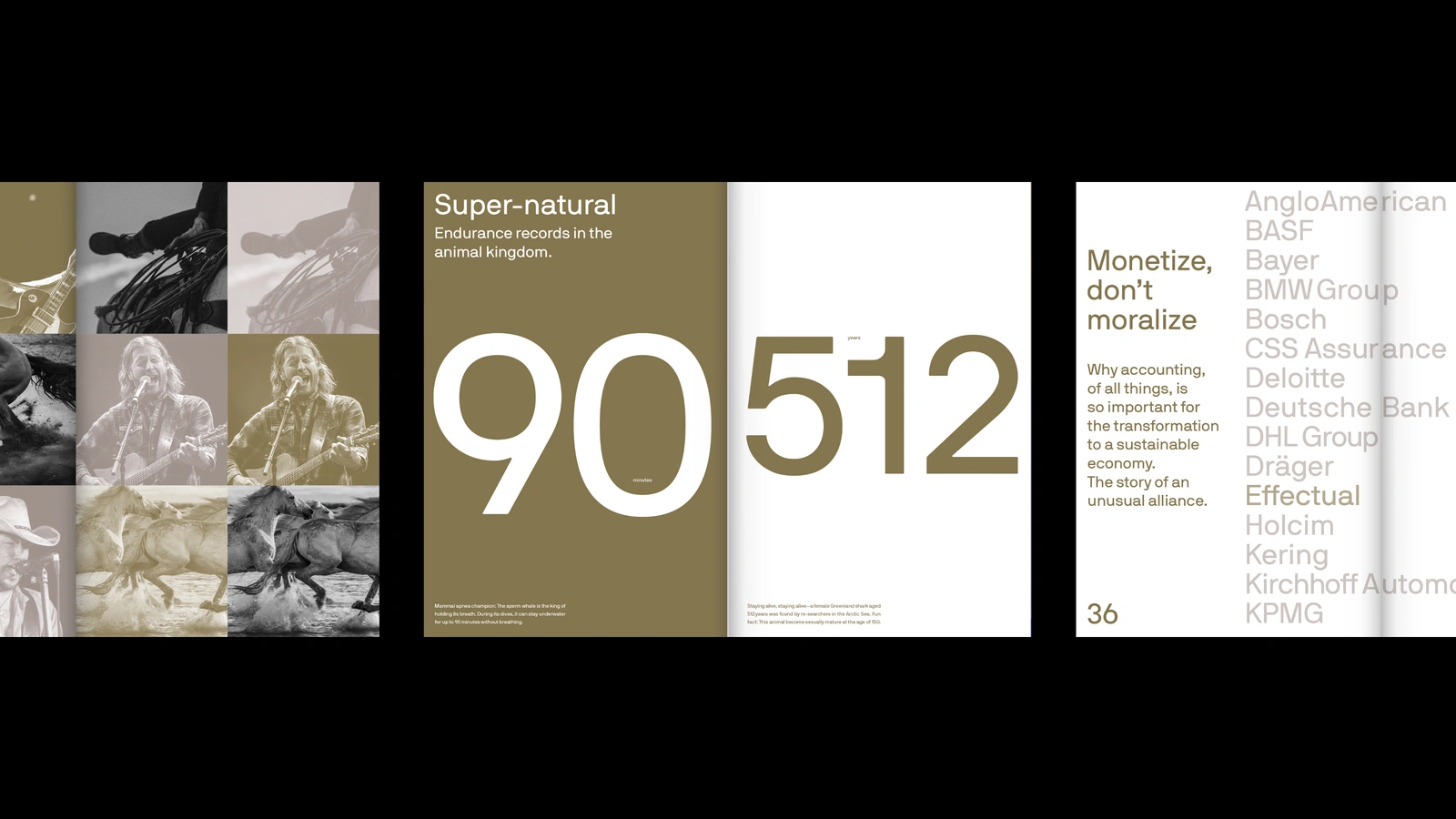
This editorial layout showcases a clean, minimalist design with prominent typography, large numerical figures, and muted earthy background tones. The pages combine textual articles about endurance records with structured lists of corporate partner names. The visual style emphasises clarity and sophisticated grid alignment typical of high-end publication design. The project was conceived and directed by NAMENAME Creative Partners working across Berlin and Porto.