Yonder: Brand Identity

Aug 2020
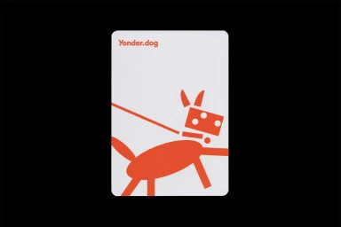
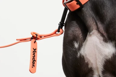
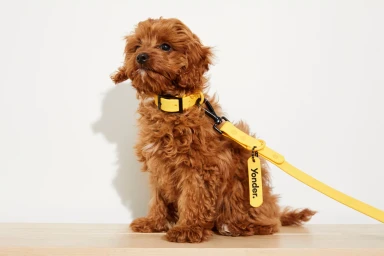
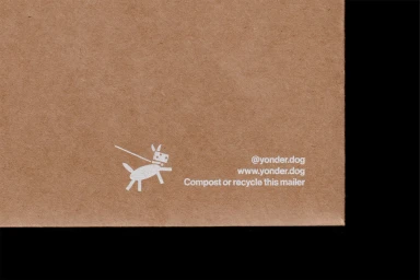
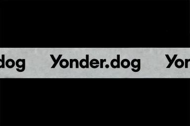
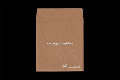
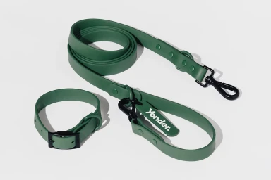
The brand identity for Yonder establishes a striking visual language within the pet accessories industry, balancing playful character with a sophisticated, modernist edge. Executed through the collaborative lens of Never Now for graphic design and Sam Wong for photography, the visual system leans into a high-contrast aesthetic that feels both accessible and distinctly premium. By utilizing a deliberate palette of saturated oranges, vibrant yellows, and muted sage greens, the identity avoids the typical tropes of the category, opting instead for a clean, minimalist approach that prioritizes negative space and high-legibility typography. Whether through the bold, vector-based dog illustrations or the clinical precision of macro product shots, the work effectively channels a sense of intentionality and eco-conscious quality. The imagery—ranging from high-key studio captures of curious puppies to the tactile, organic texture of sustainable cardboard shipping mailers—demonstrates a cohesive versatility across both digital and physical touchpoints. This project stands out for its structural restraint, allowing the brand to feel established yet approachable. By anchoring the identity in sharp, sans-serif type and balanced compositions, the work successfully navigates the intersection of commercial appeal and refined graphic design. The result is a memorable brand presence that feels perfectly at home in a contemporary market, proving that functional pet hardware can be elevated into a cohesive, high-fashion-adjacent lifestyle statement.
Vertical, Clean, Minimalist, Commercial
E-commerce / Product