
Werkha: Brand Identity

Jul 2020
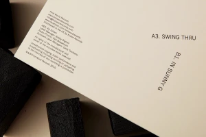
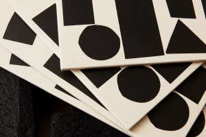
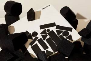
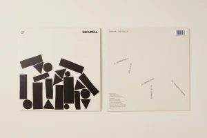
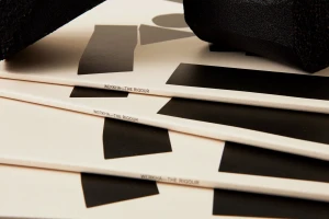
The brand identity for Werkha, titled The Rigour, masterfully balances musical precision with an avant-garde visual language that pushes the boundaries of modern music packaging design. Executed with a sharp focus on editorial minimalism, the project employs a high-contrast monochromatic palette where bold black geometric shapes, including circles, rectangles, and triangles, collide against warm, cream-colored paper stocks. The creative direction, led by POST, leans into a tactile sensory experience by contrasting the smooth, flat surfaces of printed vinyl sleeves and record labels with the coarse, porous textures of matte black foam blocks. This interplay between two-dimensional graphic typography and three-dimensional sculptural forms creates a dynamic, layered composition that feels both architectural and rhythmic. By utilizing soft, even natural light to emphasize the subtle paper textures and the deep, concentric grooves of the vinyl itself, the branding maintains a professional yet deeply artistic cohesion. The result is a sophisticated visual identity that feels at home in a high-end design archive while remaining rooted in the functional necessities of commercial music distribution. Through macro-style photography and careful attention to the relationship between negative space and dense patterns, the identity for The Rigour captures a distinct, cinematic aesthetic that elevates the listening experience into a cohesive and memorable graphic object.
Horizontal, Commercial, Clean, Minimalist
Typography
Brand Film / Corporate Video
