
Watson Morgan: Brand Identity




May 2018
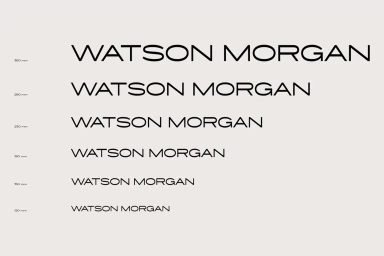
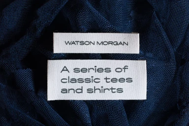
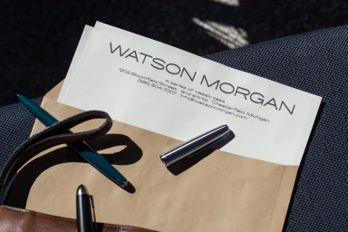
The brand identity for Watson Morgan emerges as a masterclass in corporate minimalism, demonstrating how strategic visual restraint can cultivate a distinct, premium market presence. Orchestrated by graphic designer Vencho Miloshevski, the project anchors itself in a high-contrast black and white palette, utilizing a clean, geometric sans-serif typeface that prioritizes legibility and functional elegance. This corporate branding effort extends beyond mere logo design, manifesting as a comprehensive visual language that breathes life into both digital and physical touchpoints. From the precision of vector-based layouts defined in technical brand guidelines to the tactile application on woven garment labels, every asset reinforces a commitment to understated luxury. The project leans into a balanced interplay of textures, contrasting crisp matte papers and smooth cotton fabrics against the depth of navy mesh and rich earth tones. Editorial lifestyle imagery—featuring garments billowing in natural light—successfully softens the brand’s clinical roots, infusing the identity with a sense of everyday ease and cinematic soul. By leveraging deliberate negative space and consistent scaling, the design maintains an impeccable visual hierarchy whether applied to professional stationery, bespoke packaging, or apparel. Ultimately, this work captures the essence of a modern label, proving that simplicity, when executed with meticulous attention to detail and material quality, creates the most enduring and professional brand impressions.
Horizontal, Commercial, Clean
