
Vinos Chidos: Brand Identity



Jun 2020
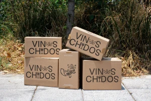
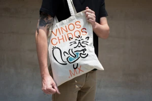
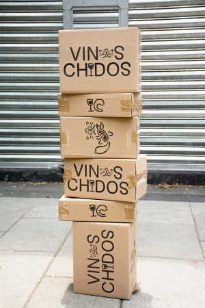
The brand identity for Vinos Chidos successfully navigates the intersection of accessibility and high-end viticulture, establishing a visual language that feels both modern and inherently approachable. Developed by FAENA, this comprehensive graphic design project eschews the stuffiness often associated with premium wine, instead opting for a playful, character-driven aesthetic. The identity centers on a clever, minimalist logo that integrates cat imagery with wine iconography—replacing the letter O with a stylized feline face and turning the letter I into a slender wine glass. This consistent use of vector illustration and clean, sans-serif typography permeates every touchpoint, from the digital UI illustration seen across responsive web layouts to the physical presence of branded merchandise like cream-colored cotton tote bags. Utilizing a sophisticated color palette of muted teals, dark charcoal, and soft coral accents, the brand balances its artistic, playful nature with a sharp, corporate sensibility. Whether showcased on cardboard shipping boxes in natural light or within the minimalist frames of vertical poster layouts, the execution remains remarkably cohesive. By leaning into natural light and textured environments, the photography emphasizes the tactile quality of the materials, effectively translating the brand's digital-first identity into tangible, real-world interactions that invite the consumer into the Vinos Chidos narrative with wit and professional polish.
Horizontal, Commercial, Clean
