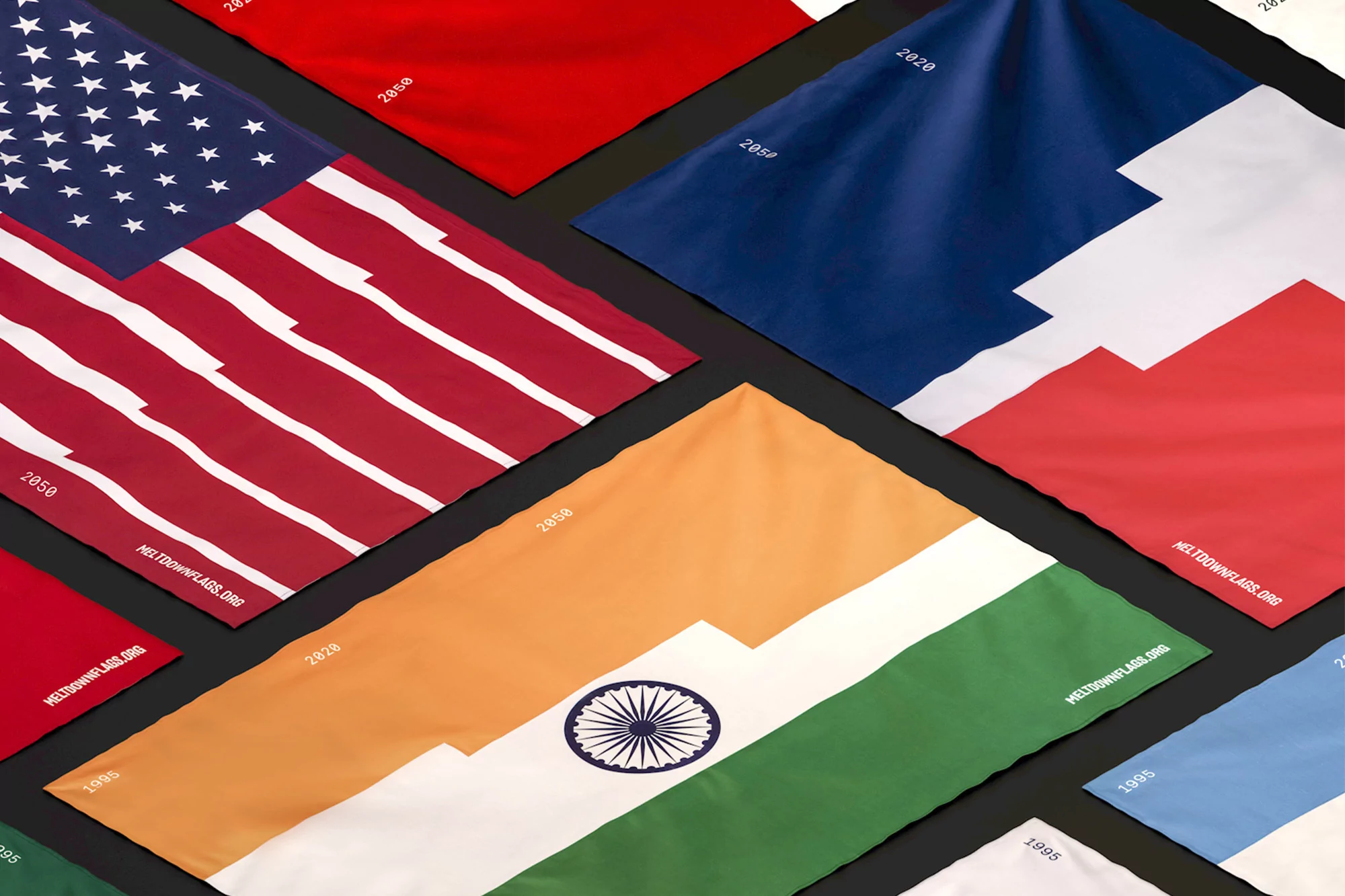
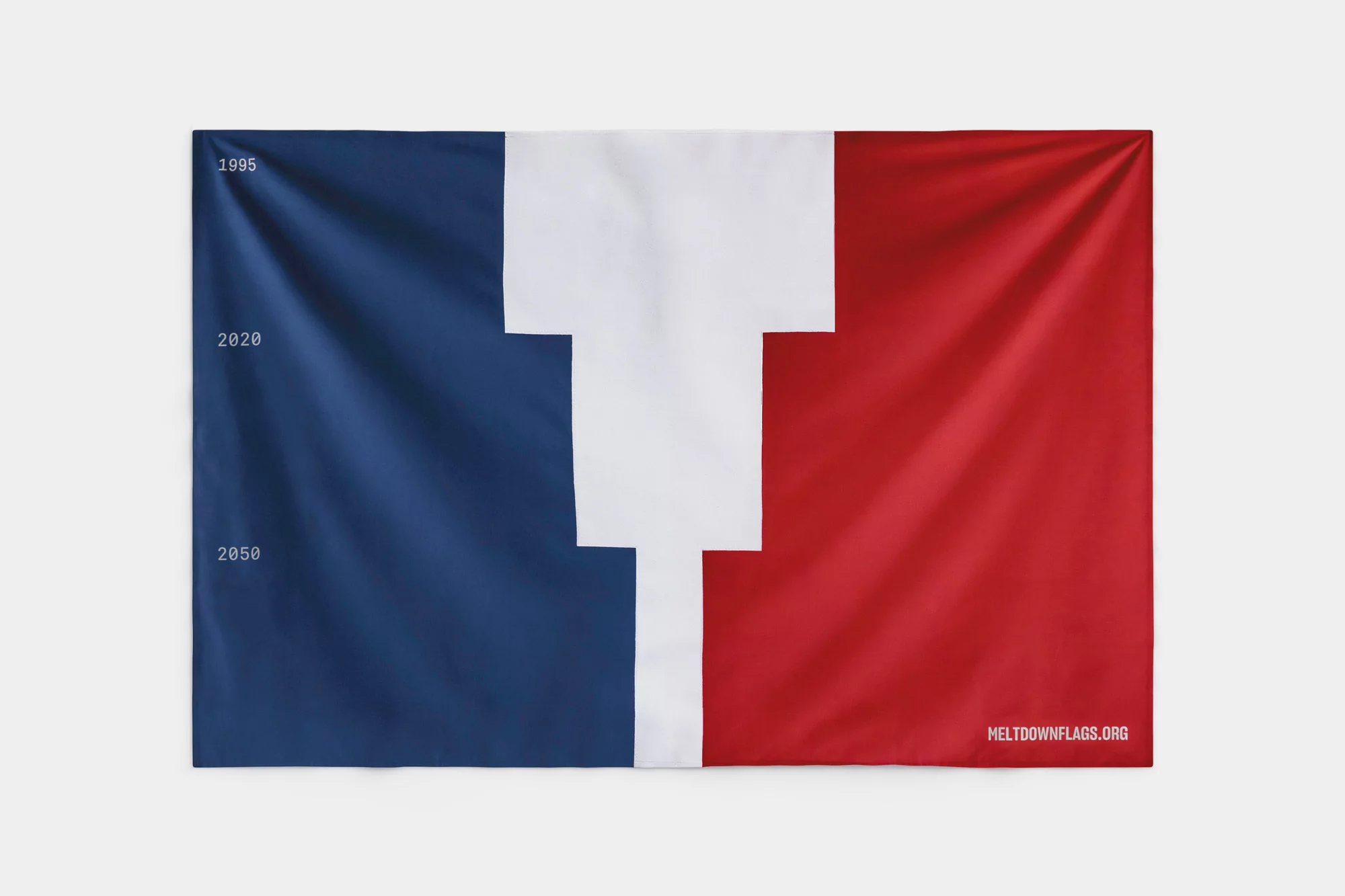
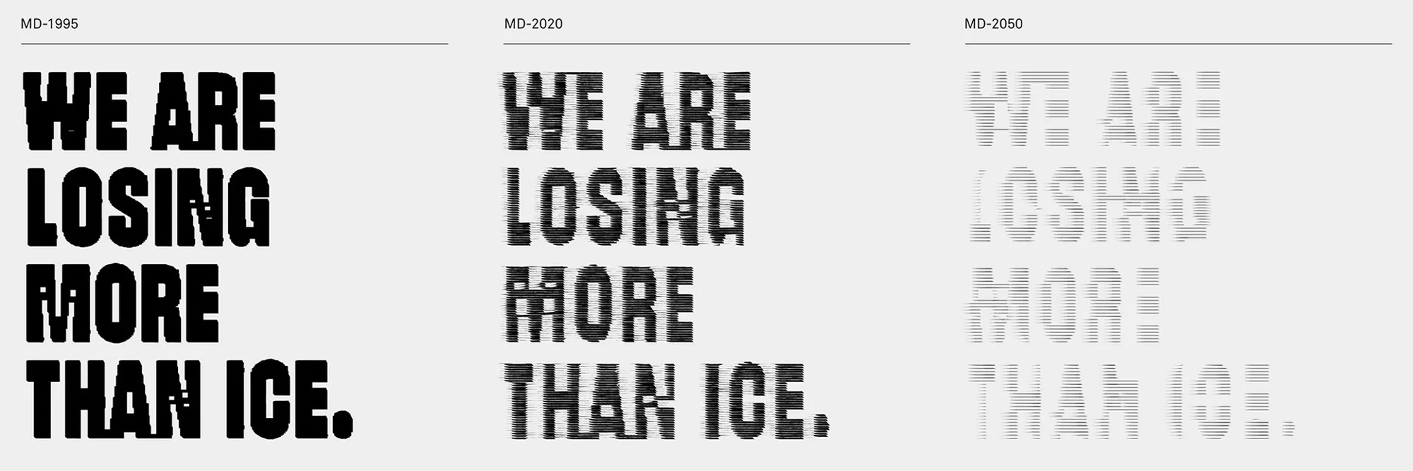
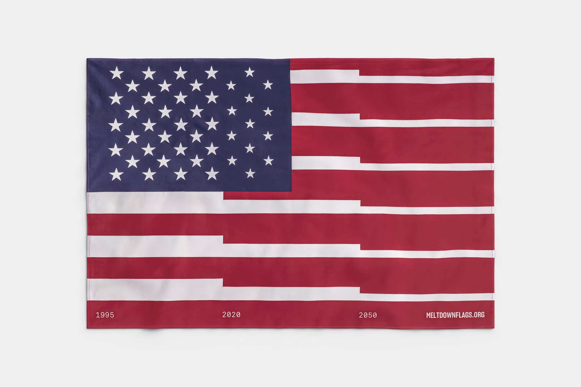
The Brand Identity for Meltdown Flags is a striking example of how visual design can translate complex environmental data into a visceral, public-facing narrative. Developed by Moby Digg, the project functions as an expansive non-profit campaign that utilizes the traditional symbolism of national flags to convey the urgent reality of melting glaciers. By employing a clever design intervention—where fabric stripes and icons are physically fragmented or stepped in a shrinking sequence—the work serves as a powerful infographic that tracks climate degradation from 1995 through the projected 2050 timeline. The project leans into artistic, minimalist aesthetics, blending documentary-style photography with sophisticated typography to ensure the message remains both academic and accessible. Across various media, including static UI illustration, live-action lifestyle photography, and editorial animation, the team maintains a consistent, clean language that relies on high-key lighting and neutral backdrops to let the graphic interventions speak for themselves. The use of VFX and digital glitch effects in the typographic treatments adds a layer of modern, data-driven urgency, emphasizing that we are losing more than just ice. Through this disciplined yet poignant approach to public awareness, the project creates a bridge between digital design and real-world demonstration, proving that thoughtful brand identity can play a pivotal role in shaping contemporary climate discourse.