
unknown: Brand Identity

May 2025
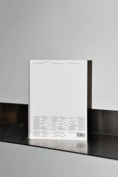
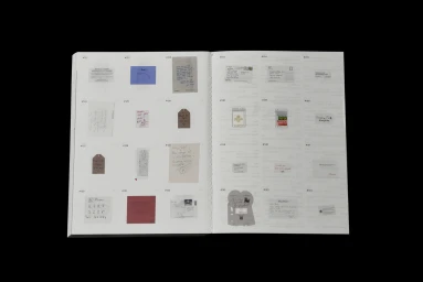
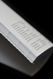
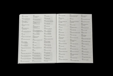
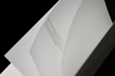
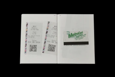
This brand identity project, designed by Joyce Shi and published by G Axis Press, explores the intersection of editorial design and archival documentation. The publication features a minimalist aesthetic, utilizing the Acumin typeface to organize a collection of ephemera, including transit tickets, baggage checks, and personal records. Captured with a clean, documentary-style approach, the work leans into a monochrome palette. The layout relies on structured grids and precise typographic hierarchies to transform everyday items into an indexed, cohesive printed volume. The project employs a mix of macro photography and minimalist spreads to emphasize the texture and physical construction of the book.
Horizontal, Clean, Editorial
Typography
Black Seamless
Editorial


