
unknown: Brand Identity




Apr 2020
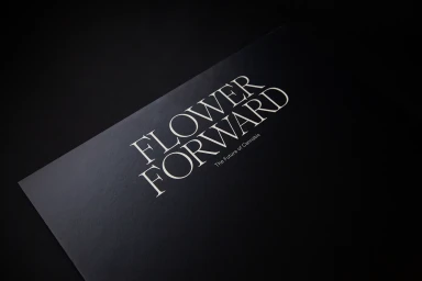
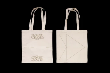
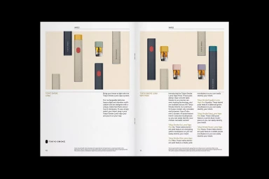
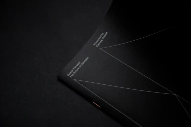
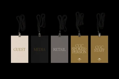
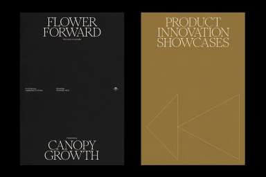
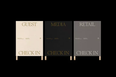
The Flower Forward brand identity project, spearheaded by the design agency Cossette, marks a masterclass in corporate minimalism and sophisticated visual storytelling. By stripping away the noise often associated with the cannabis industry, the identity leans into a clean, refined aesthetic that elevates the brand to a premium, institutional level. The project centers on a highly cohesive graphic design language defined by elegant serif typography, restrained monochromatic palettes, and a masterful use of negative space. Across a variety of collateral—including bespoke event badges, structured product catalogues, and atmospheric exhibition displays—the identity remains consistent, prioritizing information hierarchy and functional clarity. The execution shines in its tactical application of texture, utilizing matte black surfaces and natural-fiber textiles to ground the modern, geometric motifs in something tactile and real. Techniques such as high-contrast vector illustration and symmetrical grid-based layouts reinforce the professional, innovative nature of the work. By balancing technical precision with artistic sensibilities, the project creates a seamless bridge between a high-end exhibition space and a forward-thinking corporate philosophy. Every element, from the minimalist UI illustrations to the nuanced color coding of the event materials, serves to communicate authority and sophistication. This work not only functions as an effective brand identity but as a template for how modern, high-growth sectors can communicate with gravitas, clarity, and undeniable style in an increasingly cluttered marketplace.
Horizontal, Commercial, Clean, Minimalist
Typography
