
unknown: Brand Identity










Apr 2020
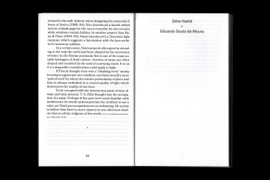
This brand identity and editorial design project for Yehuda E. Safran’s publication, I Have A Weakness For A Touch Of Red, functions as a masterclass in minimalist book design and visual rhythm. Executed by Non-verbal Club, the publication balances academic rigor with a stark, modern aesthetic that defines the intersection of digital media and architectural critique. Throughout the two hundred and seventy-six pages, the design leverages a high-contrast palette of deep navy and crisp white, punctuated by vibrant red accents that command attention. The typography is central to the project's success, utilizing clean, sharp serif fonts for body text and precise sans-serif layouts for structured indexical data. By leaning into an editorial minimalism that emphasizes geometric form and negative space, the work channels the intellectual depth of architectural theory while maintaining the accessibility of a modern journal. Every spread, from the table of contents to the dense photographic layouts, is treated with structural intent, ensuring that the physical object mirrors the complexities of the featured modernist projects. Through uniform lighting and deliberate, rhythmic text alignment, the studio has created a tactile piece of media that effectively bridges the gap between historical discourse and contemporary graphic design, ensuring that the publication remains as visually arresting as it is academically significant.
Horizontal, Clean, Minimalist, Editorial
Typography
Paper Texture
Editorial


