
unknown: Brand Identity


Apr 2020
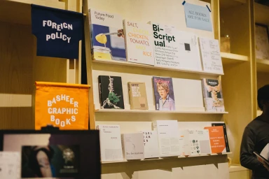
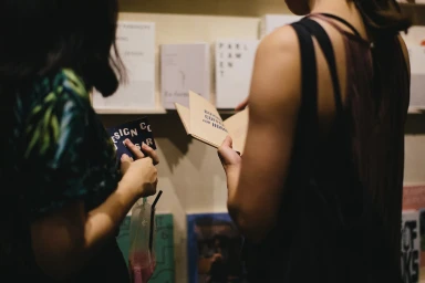
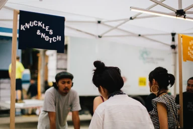
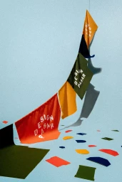
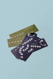
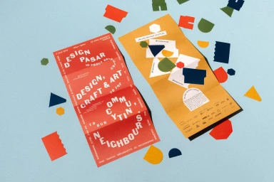
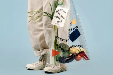
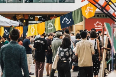
The visual identity for Design Pasar serves as a masterclass in community-focused brand architecture, seamlessly bridging the gap between high-concept graphic design and approachable, lived-in retail environments. By integrating a vibrant palette of ochre-yellow, olive green, and navy blue, the project establishes a cohesive aesthetic that feels both playful and meticulously considered. The execution spans a wide array of touchpoints, from tactile printed collateral and matte-stock coupons to structural merchandise like branded tote bags and minimalist apparel. The creative vision, helmed by the design studio Foreign Policy, leans into a clean, geometric minimalism that is brought to life through the clever use of hard and natural light. Whether documenting the lively, candid atmosphere of an outdoor market through documentary-style photography or showcasing brand components in a controlled studio setting, the work emphasizes a craft-oriented spirit. The use of repetitive, bold typography and layered pennant flags helps to anchor the identity, ensuring that the brand remains recognizable across various physical spaces. This project is a standout example of how a unified graphic language can elevate a local exhibition into a visually immersive experience, celebrating the intersection of typography, art, and retail. It succeeds by balancing high-level design rigor with a welcoming, human-centric energy that invites engagement and discovery at every turn.
Horizontal, Clean
