
unknown: Brand Identity
Apr 2018
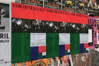
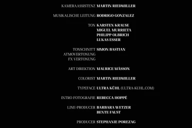
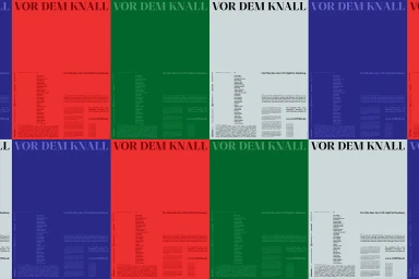
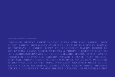
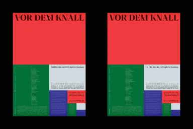
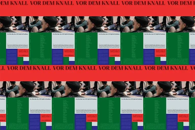
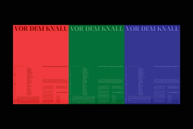
The brand identity for the documentary film Vor Dem Knall, which chronicles the G20 summit in Hamburg, presents a masterclass in modular communication and structured graphic design. Under the direction of graphic designer Maurice Masson, the visual language channels a raw, street-level energy that simultaneously adheres to the clean, professional standards required for a major media project. By employing a rigorous grid system, the work achieves a striking balance between its utilitarian corporate requirements and its more artistic, abstract sensibilities. The project leans heavily into high-contrast typography, utilizing bold serif and sans-serif fonts to command attention against a vibrant, saturated palette of primary red, forest green, and deep blue. This intentional color blocking creates a rhythmic, impactful pattern, particularly when the posters are viewed in repetition against textured urban environments like the brick walls of Hamburg. Whether presented as immersive street-level advertising or as minimalist, high-legibility end-credit sequences, the design remains cohesive and authoritative. By marrying documentary-style raw imagery with modern commercial sensibilities, the identity effectively communicates the tension of its subject matter. The execution relies on precise alignment and strategic negative space to ensure that all information remains accessible, resulting in a project that serves as both a compelling promotional campaign and a testament to the power of disciplined, minimalist visual hierarchy in the cinematic space.
Horizontal, Commercial, Clean, Graphic
Typography
