
Brand
ProjectBrand Identity
unknown Brand Identity 2018
Associated creatives

Tags
Description
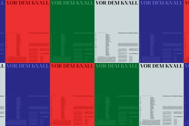
This graphic design project for Vor dem Knall, created by Maurice Masson, presents a structured multi-panel grid layout. The composition incorporates bold serif typography with prominent headings reading VOR DEM KNALL alongside dense informational text blocks. Distinct sections utilise vibrant solid colour backgrounds including red, green, light grey, and deep blue. The clean, typographic-driven arrangement showcases a minimalist yet striking visual identity system.