
unknown
Brand Identity

Apr 2018
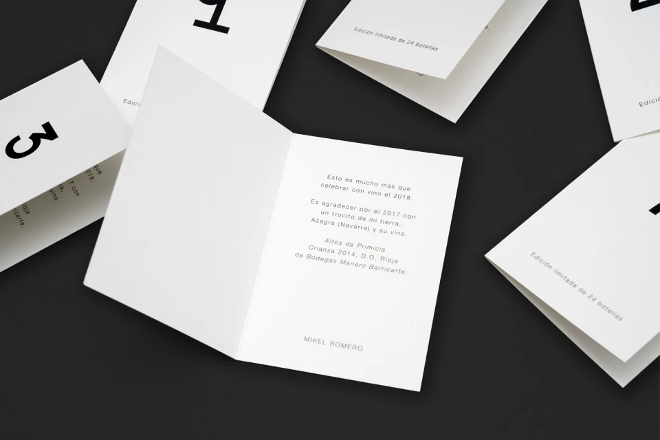
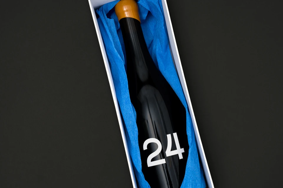
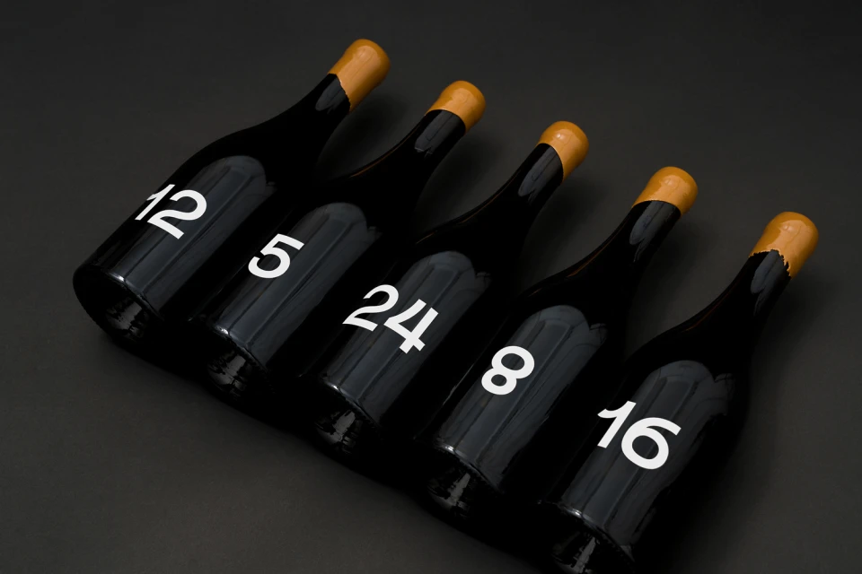
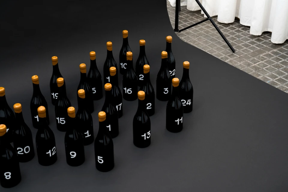
In a sophisticated masterclass of brand identity design, the visual system created by Mikel Romero for this limited edition wine collection strips back the noise of traditional beverage marketing to embrace a rigorous, structured aesthetic. By leaning into a high-contrast palette of stark black and crisp white, the project establishes a commanding graphic presence that feels both contemporary and timeless. The use of a bold, sans-serif typeface creates an immediate visual rhythm, with large-scale numbering serving as the primary design motif across every touchpoint. Each component of the identity, from the precise vector-based abstract grids to the tangible, tactile application of folded paper inserts, demonstrates a commitment to editorial minimalism and clarity. The packaging design elevates the product through a refined interaction of textures, notably the contrast between smooth glass bottles and the distinctive, matte finish of gold-dipped wax seals. Utilizing professional studio strobe lighting to emphasize the sleek contours of the dark glass, the photography brings a technical precision to the presentation that highlights the rhythmic placement of the bottles. This project successfully positions the product not just as a beverage, but as a collectable piece of graphic art, proving that restraint in typography and composition can be the most powerful tool in the food and beverage industry when crafting a premium brand experience.
Minimalist, Horizontal, Clean, Commercial
Black Seamless
E-commerce / Product
