
The Twenty Two: Brand Identity


Oct 2022
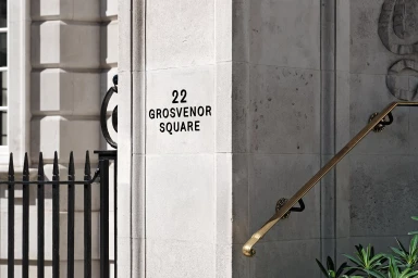
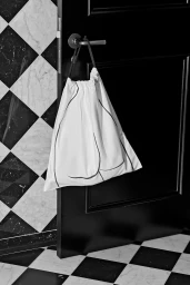
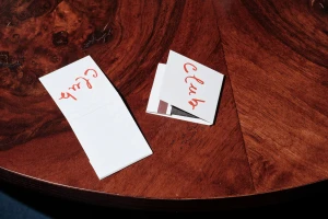
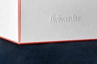
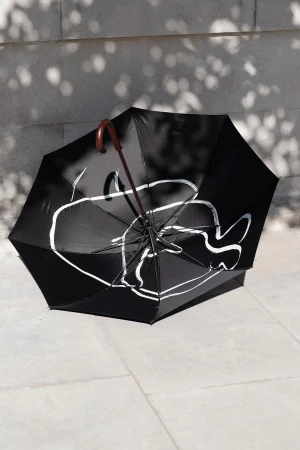
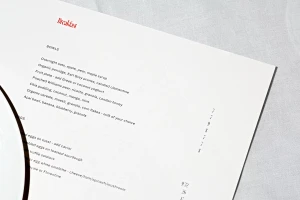
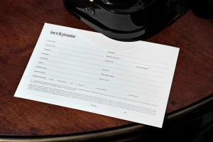
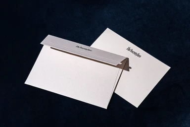
The brand identity for The Twenty Two establishes a sophisticated visual language through a curated system of collateral and signage. Developed by Javas Lehn Studio, the design system leans into a clean, minimalist aesthetic, using a disciplined palette of white, black, and vibrant red to ground the identity. Photography by Thomas Adank captures these elements with a cinematic eye, utilizing natural light to accentuate the textures of stone, wood, velvet, and paper stock. The identity features detailed illustrations by Rosie McGuiness, which appear across various touchpoints—from custom matchbooks and fabric packaging to an architectural umbrella and morning menus. Each piece functions as a deliberate exercise in tactile, polished communication, prioritizing precise typography and subtle emboss and deboss techniques.
Horizontal, Clean, Commercial
Advertising Campaign


