
The Turner Prize: Brand Identity


Nov 2025
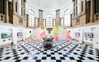
The Turner Prize 2025 brand identity, developed by design studio Rabbithole, establishes a contemporary visual language that contrasts bold, sans-serif typography with tactile paper art and organic geometry. The system leans into a minimalist aesthetic, utilizing punched-out circular voids and neon accents of pink, yellow, and green to animate the exhibition collateral, environmental signage, and digital motion graphics. The project encompasses a comprehensive rollout, from high-fidelity printed brochures and family guides to architectural installations and outdoor wayfinding. Photography by David Lindsay, Andrew Benge, and David Levene captures the identity within the neoclassical setting, highlighting the interplay between the clean, geometric graphic design and the historic exhibition architecture. Manufacturing support for the physical assets was provided by Duke Makes and Northend.
Horizontal, Commercial, Clean


