
RASSA: Brand Identity

Apr 2020
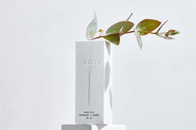
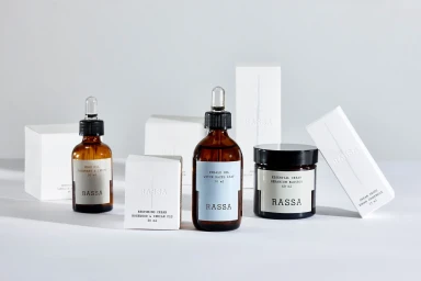
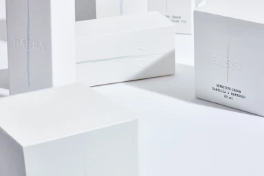
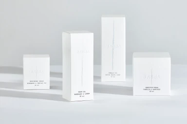
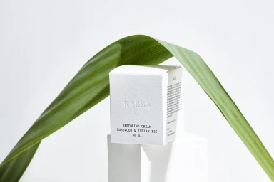
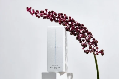
In the highly competitive landscape of premium skincare, RASSA makes a definitive statement through a brand identity project that prizes restraint over excess. By marrying a clinical, high-end aesthetic with raw, organic textures, the design language moves away from the noise of modern beauty branding to embrace a quiet, sophisticated minimalism. The project, anchored by the graphic design of U.I.WD. and the crisp lens of photographer Rodolfo Goud, leans into a monochromatic palette punctuated by the subtle tactility of emboss and deboss techniques on high-quality stock from Old Mill and Fedrigoni. This commercial work thrives on balance, juxtaposing the sharp geometric precision of white rectangular packaging against the soft, asymmetrical shapes of natural flora like eucalyptus and deep purple berries. Each composition is bathed in soft light, ensuring the shadow work provides depth while maintaining a bright, clinical, and aspirational feel. By prioritizing clean, sans-serif typography and purposeful negative space, the visual system suggests that efficacy and purity are at the heart of the RASSA ethos. This is a study in editorial minimalism, where the thoughtful interaction between material and light elevates simple skincare products into objects of genuine luxury, proving that when the identity is this refined, the product speaks for itself with undeniable authority.
Horizontal, Commercial, Clean, Minimalist
Natural light, Emboss & Deboss
White Seamless
E-commerce / Product


