
The Good Egg: Brand Identity


Jul 2018
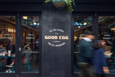
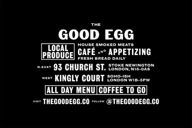
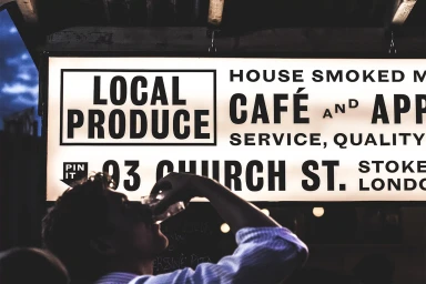
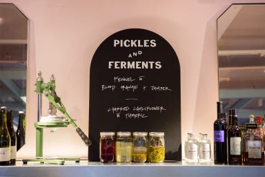
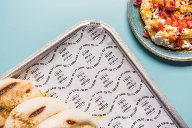
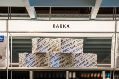
The brand identity for The Good Egg, masterfully executed by the design studio Everything In Between, serves as a masterclass in modern restaurant branding. By blending an industrial aesthetic with clean, modernist sensibilities, the project carves out a distinct visual language that feels both timeless and deeply rooted in the vibrant London food scene. The identity leans heavily into a high-contrast palette, utilizing bold sans-serif typography that feels urgent and accessible, effectively communicating the brand's focus on all-day dining and fresh, local produce. Across the various applications—from sleek menu layouts on matte teal tabletops to the architectural signage in Stoke Newington and Kingly Court—the design remains remarkably consistent. The project expertly utilizes commercial photography techniques, such as soft natural light to highlight artisanal food textures and low-key chiaroscuro lighting to capture the urban atmosphere of the storefronts at night. Through an intentional focus on graphic arrangement and editorial minimalism, the identity elevates everyday functional elements like receipts and bakery packaging into considered pieces of brand storytelling. This comprehensive visual system not only frames the restaurant's culinary offerings, including their signature babka and labneh, but also establishes a recognizable, authoritative presence that perfectly mirrors the shop's commitment to quality service and authentic, elevated cafe fare.
Horizontal, Clean, Commercial
Advertising Campaign
