
The Eames Institute: Brand Identity


Jun 2022
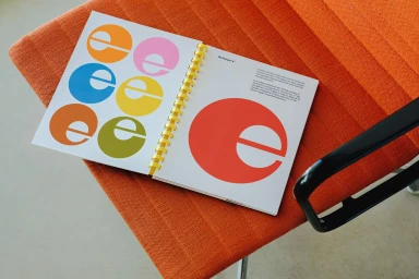
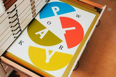
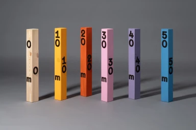
The Eames Institute brand identity project explores the intersection of archival precision and graphic experimentation. The identity system utilizes a vibrant, high-contrast colour palette of red, blue, yellow, and olive, grounded by clean, minimalist typography. Executed with a focus on geometric forms and structured layouts, the visual language extends across print collateral, outdoor signage, and motion graphics. The project incorporates archival-inspired elements, from serialized wooden blocks to modular typographic grids. Lead design work was completed by Manual, Moment, Covers, and HATO, whose collective approach emphasizes a consistent, vector-driven aesthetic across all brand touchpoints.
Horizontal, Commercial, Clean
Typography


