
BDG
Brand Identity
Nov 2015
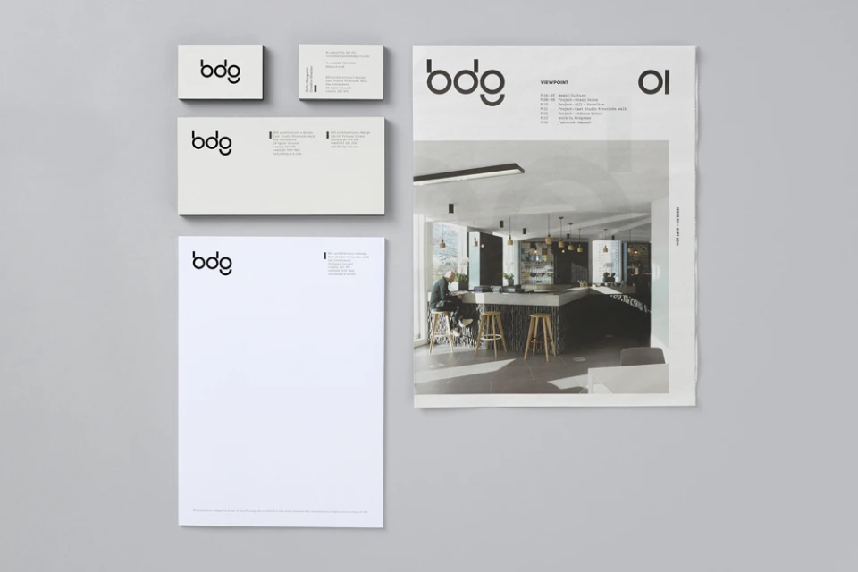
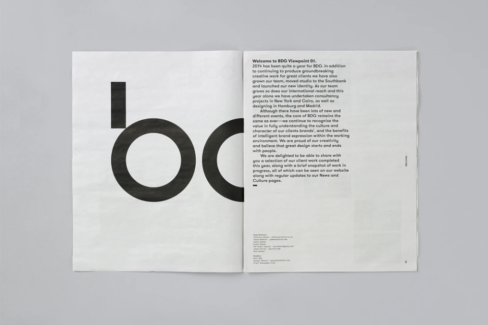
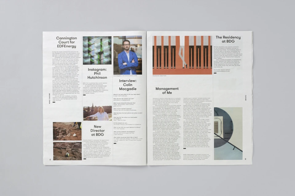
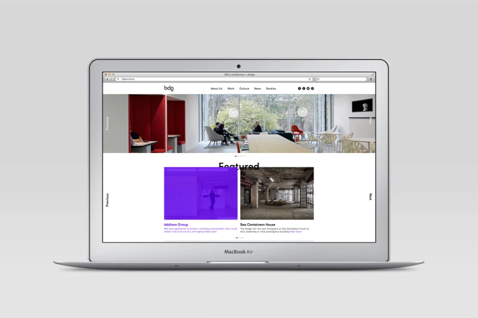
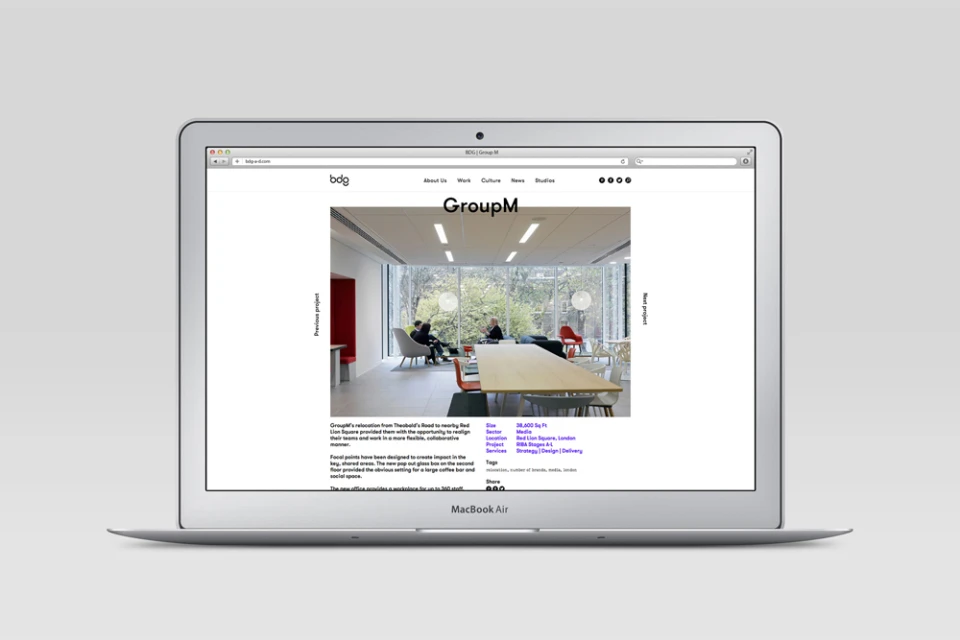
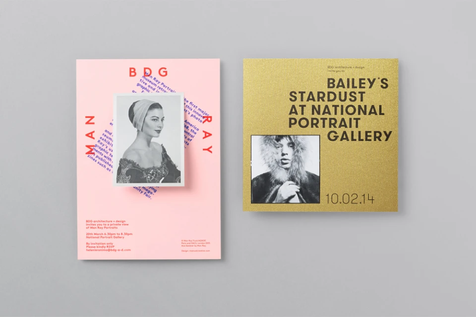
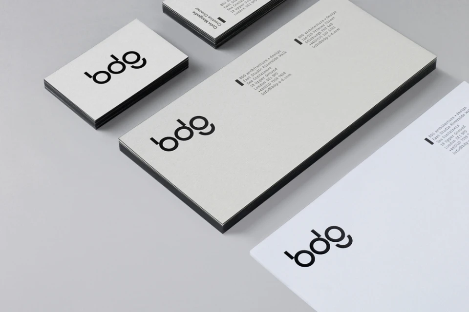
The brand identity for BDG establishes a visual language that is as structured and precise as the architectural work the firm produces. By anchoring its presence in a minimalist aesthetic, the identity leverages clean, sans-serif typography and purposeful negative space to command attention, whether applied to digital UI illustration or tactile print materials. The project, which spans a comprehensive suite of commercial and editorial assets, successfully translates the complexity of large-scale workplace design into a sleek, professional narrative. Central to this execution is a rigorous application of grid systems and a restrained, neutral color palette that allows architectural photography to stand at the forefront of the firm’s communication. This consistency is visible across every touchpoint, from the crisp alignment of stationery and high-end brochure layouts to the intuitive structure of their digital project portfolios. By blending journalistic elements with high-contrast graphic design, the identity avoids the coldness often associated with corporate branding, opting instead for a modern, gallery-style sensibility. The work by the design team, known for its masterful approach to corporate visual identity, channels a sense of understated authority. Ultimately, the project demonstrates how deliberate design choices and technical finesse in typography can transform a brand into a functional, aesthetic showcase, positioning BDG not merely as a service provider but as a leader in design and cultural discourse.
Horizontal, Clean, Minimalist
Typography
