
The British Academy: Brand Identity






Dec 2018
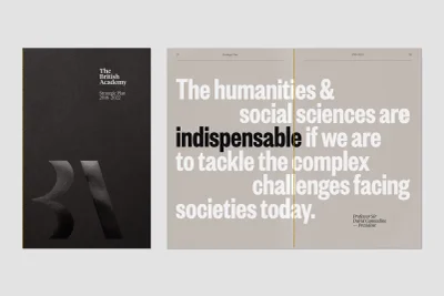
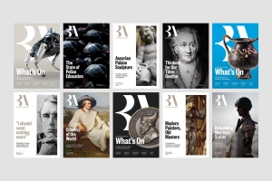
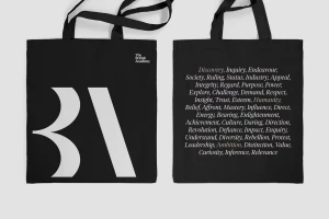
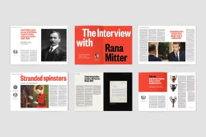
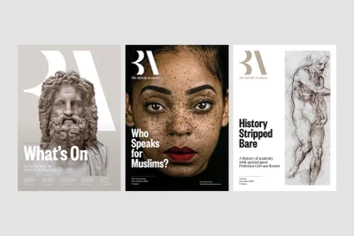
The British Academy identity project, spearheaded by design studio Only, offers a masterclass in institutional branding within the digital media and entertainment space. By balancing the weight of historical scholarship with the demands of modern communication, the visual identity employs a sophisticated, minimalist aesthetic that feels both authoritative and approachable. Central to this cohesive system is an emphasis on bold, high-contrast typography, which acts as the anchor for diverse applications—ranging from academic hardback spines and editorial magazine spreads to sprawling urban billboards. The design language expertly navigates the tension between tradition and innovation by pairing neoclassical imagery and archival portraits with punchy, contemporary sans-serif layouts. Techniques like emboss and deboss add a tactile dimension to print collateral, while the consistent use of color-blocked backgrounds and structural grid systems ensures the brand remains instantly recognizable across UI illustrations, merchandise, and environmental displays. This project reads as an exercise in rigorous editorial design, where the focus remains steadfastly on information hierarchy and clarity. By utilizing natural light in its commercial photography and maintaining a clean, studio-style production quality, the brand identity project elevates academic discourse into a compelling visual narrative that feels at home in both elite institutions and the public square, successfully positioning the academy as a living, breathing voice in global humanities.
Commercial, Clean, Horizontal
Typography
