
design platform Vizcom puts process over polish
Brand Identity

Aug 2026
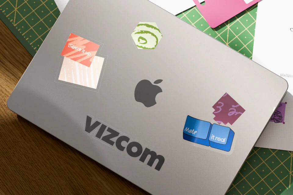
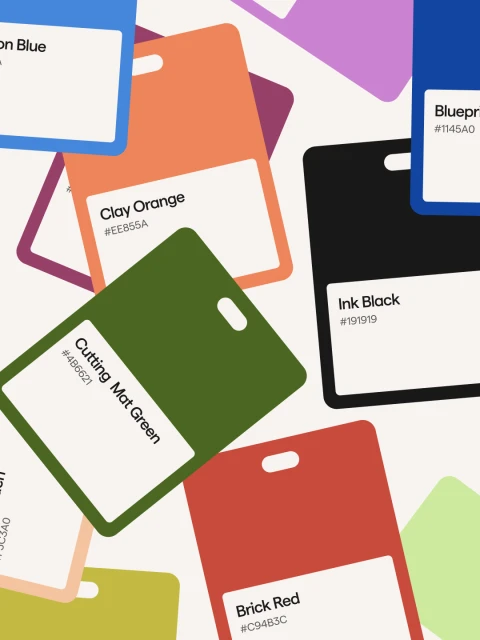
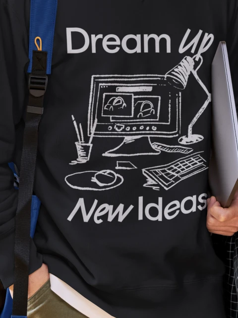
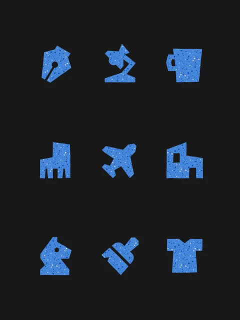
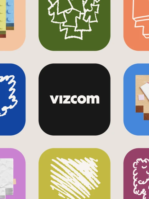
The new brand identity for digital design platform Vizcom marks a departure from conventional, high-gloss tech aesthetics, favoring a visual language that celebrates the raw, iterative process of creation over polished finality. Orchestrated with design contributions from Outland, illustration by Harri Owain, and 3D work from Krystof Jezek, the identity leans into a modular, experimental ethos. The brand relies on a combination of vector typography and clean, modern design principles to establish a professional yet approachable presence. This approach is anchored by a vibrant, tactile color palette—ranging from Clay Orange to Cutting Mat Green—which draws inspiration from the physical tools of the design trade. By integrating UI illustration alongside live-action technique, the project bridges the gap between digital workspace efficiency and analog creativity. The use of a technical light-blue grid against deep blue backgrounds provides a rigid, structural foundation, which is then softened by playful, speckled blue icon sets and stickers that embody the brand mantra to sketch up and make ideas real. Whether displayed through structured icon grids or captured in lifestyle compositions, the identity succeeds by positioning the brand not just as a tool, but as a collaborative companion for creative professionals. This comprehensive branding strategy effectively translates the complex functionality of the app into a cohesive, process-oriented visual narrative that feels both grounded and deeply innovative.
Clean, Vertical, Graphic
Apps & Digital Platforms


