
SWIRL: Brand Identity
Sep 2020
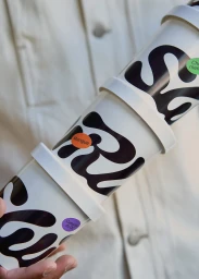
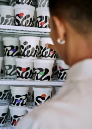
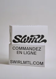
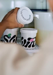
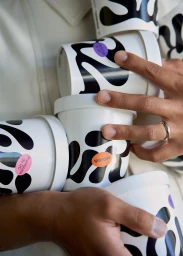
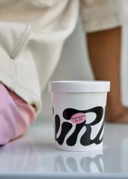
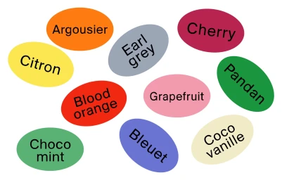
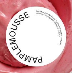
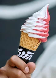
The brand identity for SWIRL breathes a refreshing, minimalist sophistication into the CPG and food and beverage landscape. By moving away from the cluttered visual noise often found in frozen dessert packaging, the project leans into a clean, high-contrast aesthetic that feels both modern and deeply tactile. The visual language centers on a bold, organic black swirl pattern that wraps fluidly around stark white containers, creating a cohesive and instantly recognizable shelf presence. Through the expert graphic design by Wedge, the identity leverages a striking, stylized typeface that feels structural yet playful, effectively balancing professional corporate rigor with an approachable, artisan quality. Across a diverse array of assets—from macro product shots showcasing the dense, vibrant textures of the sorbet to lifestyle images capturing authentic, casual interactions in a retail freezer—the campaign maintains a unified look defined by soft, even lighting and an editorial sensibility. The use of bright, circular flavor labels adds a necessary pop of color, providing an energetic contrast to the monochromatic base. Whether through cinematic close-ups of soft-serve or precise vector illustrations of the flavor palette, the project effectively communicates a premium, design-forward experience. By prioritizing clean lines and deliberate composition, SWIRL successfully establishes a distinct visual signature that feels as intentional as it is delicious, proving that thoughtful, stripped-back branding is the ultimate ingredient for long-term consumer connection.
Vertical, Clean, Commercial
E-commerce / Product
