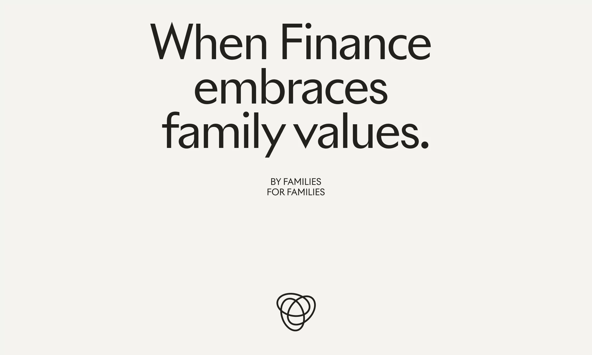
The brand identity for Spring Equity Partners establishes a minimalist and institutional visual language across finance and investment communications. Developed with graphic design by Hymn, the identity leverages clean typography and a responsive logo system featuring three interlocking rings.
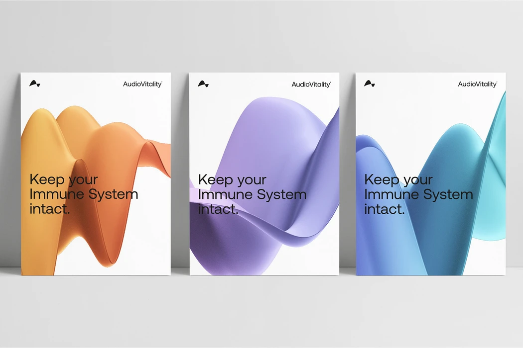
The project incorporates a versatile graphic design aesthetic, utilizing motion graphics and vector animation to articulate the brand's corporate structure. The visual system balances professional, high-contrast layouts with abstract geometric patterns that explore color modulation and fluid motion, providing a contemporary framework for corporate messaging.