
Shpock
Brand Identity



Sep 2020
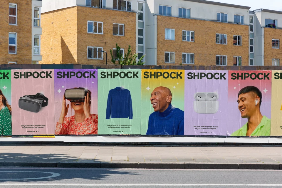
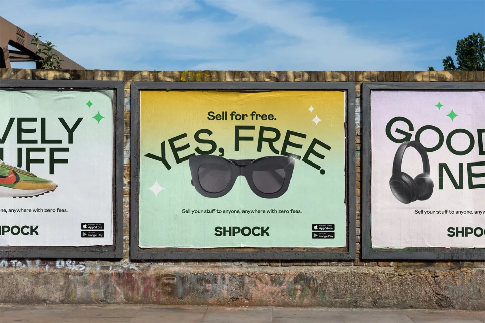
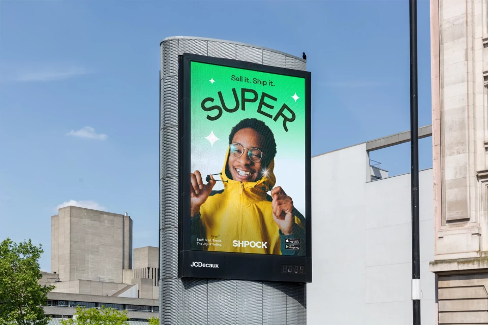
Shpock has undergone a comprehensive visual evolution, repositioning its e-commerce platform through a bold and energetic brand identity campaign that seamlessly bridges the gap between digital utility and physical presence. Executed by the design team at Koto, the new visual language relies on a vibrant palette of gradients and minimalist typography to breathe fresh life into the peer-to-peer marketplace. The project manifests as a sophisticated interplay of commercial street marketing and sleek UI illustration, effectively normalizing the secondhand shopping experience for a modern audience. By utilizing high-energy, live-action techniques alongside crisp graphic design, the campaign captures a diverse range of personality-driven imagery—from candid street portraits of users to meticulously styled product shots. This approach creates a cohesive, high-visibility aesthetic that feels both approachable and contemporary. Whether plastered across urban construction hoardings under natural light or rendered on digital billboards, the branding remains strikingly consistent. The use of soft lighting and intentional, clean composition highlights the platform's user-friendly interface, turning everyday retail into an aspirational lifestyle moment. With its clever use of star-motif icons and punchy taglines, the identity overhaul succeeds in making the concept of reselling feel vibrant, accessible, and distinctly premium, solidifying the brand's place as a dominant force in the competitive landscape of digital retail.
Horizontal, Commercial, Clean
Typography
E-commerce Platforms
