
Norton Museum of Art
Brand Identity
Aug 2026
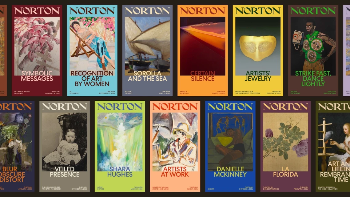
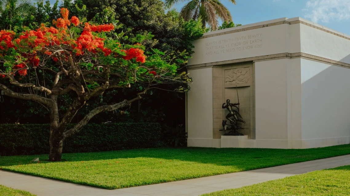
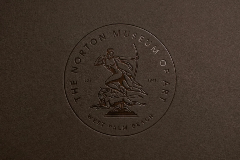
The Norton Museum of Art brand identity project masterfully navigates the intersection of cultural heritage and contemporary design, establishing a visual language that feels as expansive as the institution's own collection. Executed by the creative studio Koto, the branding leans into a sophisticated balance of geometric precision and organic warmth. This comprehensive system does not merely decorate; it serves as a functional framework for the diverse exhibition cycle, from the vibrant, expressive canvases of Shara Hughes to the classical intimacy of Sorolla and the Sea. The identity work utilizes a distinct approach to typography, allowing each promotional poster to hold its own weight while maintaining a cohesive corporate presence across various media touchpoints. Through a thoughtful integration of minimalist design and high-tactile print production, such as the debossed logo applications on heavy, earthen-toned paper stock, the brand achieves a tangible sense of refinement. The project extends beyond flat graphics, finding harmony in the physical landscape of the museum grounds where natural light and cinematic architectural photography bridge the gap between the building's clean, modern lines and the living, blooming environment of the surrounding sculpture gardens. Ultimately, the rebranding project provides a versatile toolkit for a major entertainment and media player, grounding the museum's identity in both rigorous craft and a welcoming, human-centric aesthetic that speaks to both casual visitors and long-time art enthusiasts.
Commercial, Horizontal
Motion Graphics
Brand Film / Corporate Video
