
Santi: Brand Identity
Sep 2021
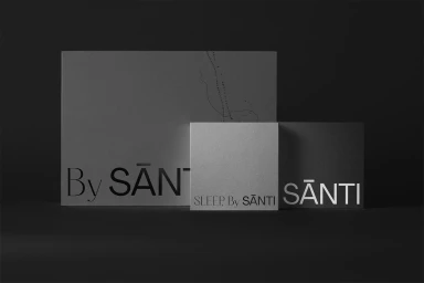
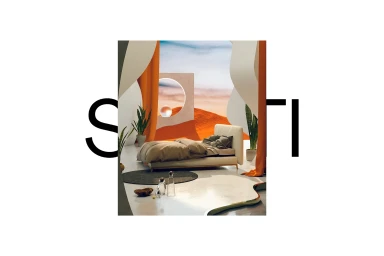
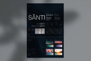
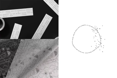
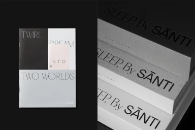
The brand identity for Santi centres on a minimalist graphic language, developed by Ensemble and Chris Barneau. The project establishes a cohesive visual system through a deliberate balance of typography and texture, utilising a stark monochrome palette accented by pale tones. The system integrates clean serif and sans-serif typefaces—specifically Suisse BP Int'l and Hatton—across varied touchpoints, from packaging to printed brand guidelines. These typographic elements are paired with 3D render/CGI visuals and debossed finishes to create a tactile, contemporary aesthetic. Abstract interior scenes and geometric patterns round out the identity, providing a structured framework for the brand. The execution focuses on precision, utilising minimalist design and vector-based assets to maintain clarity across all printed and digital formats.
Horizontal, Commercial, Minimalist, Clean
Typography

