
Blackjack Brew Co: Brand Identity
Aug 2024
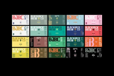
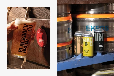
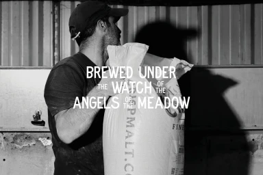
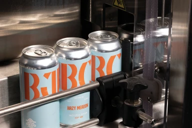
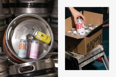
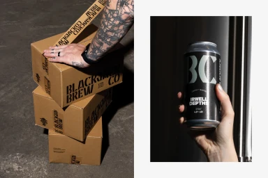
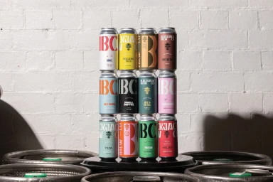
Blackjack Brew Co establishes its market presence through a multifaceted brand identity that balances industrial heritage with contemporary graphic design. The system centers on a vibrant, typographic-led packaging suite, utilizing bold serif and sans-serif fonts alongside intricate crests to create a distinct visual language across its range of beverages. Ensemble led the graphic design, crafting a cohesive system that thrives in both matte and metallic textures. The imagery captures this identity within the active brewery environment, juxtaposing the precision of canning lines and industrial kegs against raw, monochrome shots of production. The project employs a range of aesthetic techniques, from high-contrast chiaroscuro lighting in the brewery shots to clean, commercial compositions that highlight the interplay of typography and material.
Horizontal, Commercial, Clean
Advertising Campaign
