
Saison: Brand Identity

Sep 2018
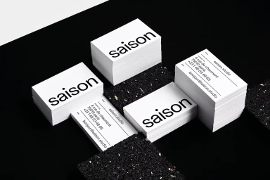
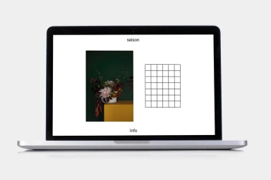
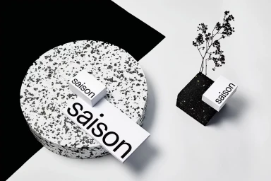
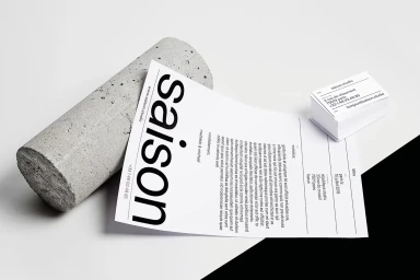
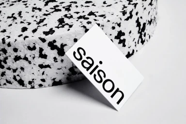
The brand identity for Saison, developed with meticulous graphic design by République Studio, exemplifies a masterclass in contemporary minimalist aesthetics. By grounding the brand in a stark, high-contrast monochrome palette, the project achieves a sophisticated and highly structured corporate presence that feels both timeless and precise. Each element of the stationery suite, from the bold sans-serif typography on the letterheads to the tactile interplay between smooth card stock and coarse, granular props like concrete and speckled terrazzo, demonstrates a deliberate focus on material hierarchy. The visual language leans into editorial minimalism, utilizing soft light to accentuate clean geometric forms and purposeful negative space. Beyond the printed assets, the project extends its clean, modern vision into digital domains, with UI illustrations that mirror the site's offline clarity through simple grids and balanced layouts. This cohesive design system avoids unnecessary ornamentation, instead prioritizing typographic clarity and refined spatial arrangement to convey a sense of professional authority. By isolating the identity down to its most essential parts—a lowercase typeface and a singular, focal point—the work highlights a commitment to absolute purity in communication. The resulting body of work functions as an abstract, artistic exploration of brand perception, proving that in a crowded marketplace, the most impactful statements are often those delivered with the greatest restraint, focus, and structural intelligence.
Horizontal, Commercial, Clean, Minimalist
Typography
White Seamless
Advertising Campaign
