
Barrault Pressacco: Brand Identity
Oct 2019
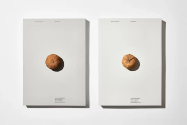
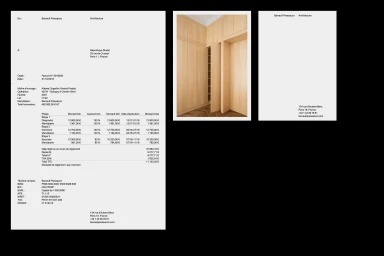
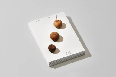
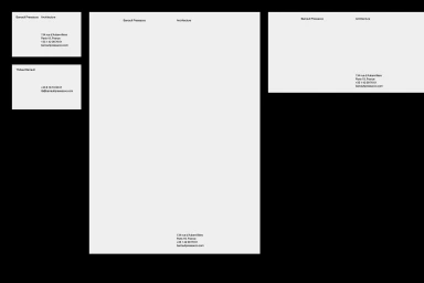
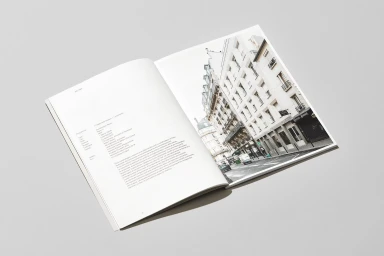
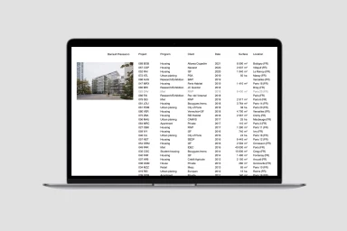
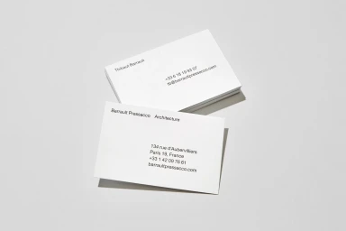
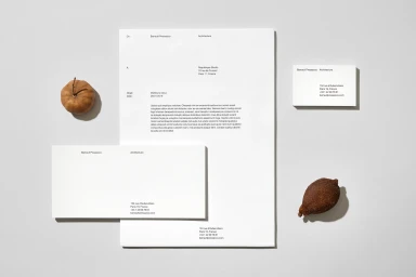
The brand identity for Barrault Pressacco serves as a masterclass in architectural restraint and editorial minimalism within the real estate platforms sector. Moving away from the typical noise of corporate collateral, this project embraces a stripped-back aesthetic where typography acts as the primary visual anchor. By pairing a refined, modern sans-serif typeface with a stark, neutral color palette, the identity mirrors the precision expected of an architecture firm. The design language leans into a deliberate contrast, juxtaposing the rigid, mathematical nature of structured grid layouts and stationery against organic elements like dried fruit and botanical pods. This interplay, captured with a blend of hard light to sharpen shadows and soft light to maintain tactile depth, brings a sculptural quality to otherwise standard business documents. Developed with sophisticated graphic design by République Studio, the project extends its minimalist philosophy across every touchpoint, from formal invoices and business cards to complex UI illustrations for web-based data tables. The editorial nature of the printed materials, featuring high-contrast photography of Parisian architecture alongside precise typographic notes, positions Barrault Pressacco as a firm that views brand communication as an extension of their built work. Through this highly organized and consistent approach, the identity ensures that every interaction feels both professional and artistic, grounding the firm in a clean, contemporary vernacular that prioritizes clarity above all else.
Horizontal, Commercial, Clean, Minimalist
Typography
Grey Seamless
