
Red Bull: Brand Identity
Aug 2019
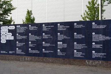
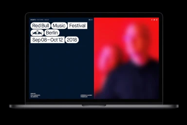
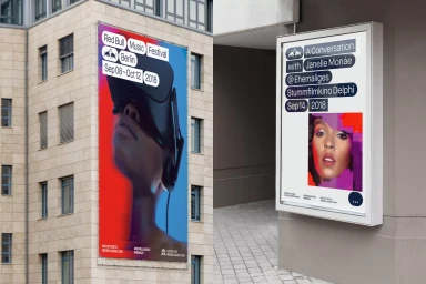
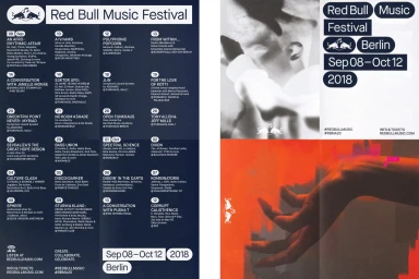
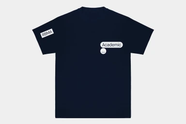
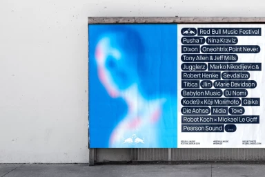
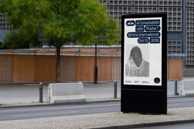
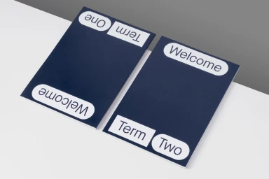
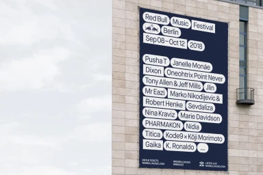
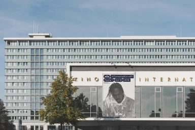
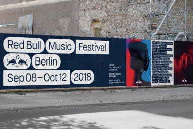
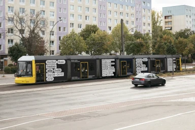
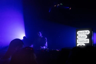
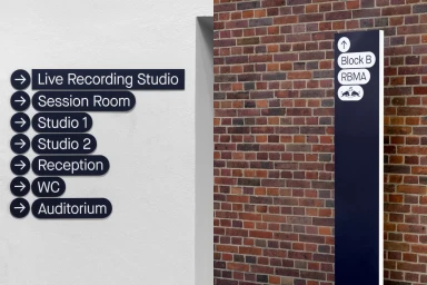
For the 2018 Red Bull Music Festival Berlin, the creative studio HelloMe delivered a comprehensive brand identity that masterfully bridged the gap between large-scale urban signage and intimate digital communication. Operating within the festivals and events sector, the project leans into a modernist aesthetic defined by rigorous typographic hierarchy and bold color blocking, utilizing a deep navy blue and stark white palette to maintain visual consistency across diverse applications. The work seamlessly transitions from high-impact outdoor advertisements mounted on brutalist architecture to functional wayfinding systems and meticulously designed digital interfaces. By employing techniques like editorial typography and motion graphics elements, the identity creates a unified visual language that feels both authoritative and approachable. Whether seen on a public tram wrap, a minimalist merchandise flat lay, or a high-contrast concert poster, the design prioritizes clarity through the use of rounded-rectangle capsules and sans-serif typefaces. The execution successfully balances the raw energy of live music with the precision of corporate branding, resulting in a cohesive experience that anchors the festival within the Berlin streetscape. This project serves as an exemplary case study in how a cohesive visual system can elevate the perception of a global event while remaining deeply integrated into the local urban environment.
Horizontal, Commercial, Clean
Typography
