
Primary
Brand Identity

Sep 2016
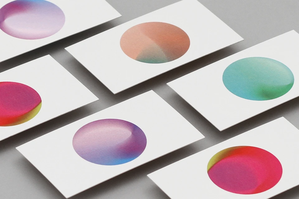
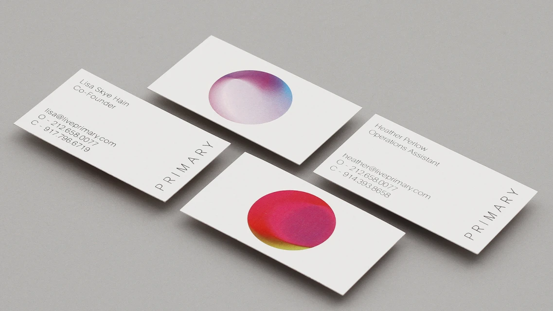
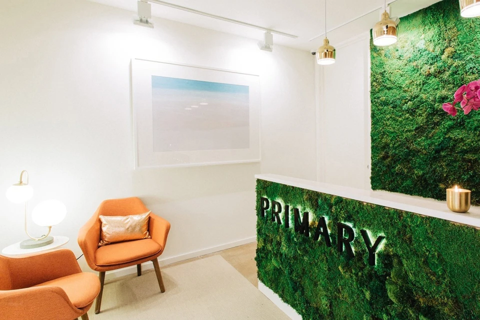
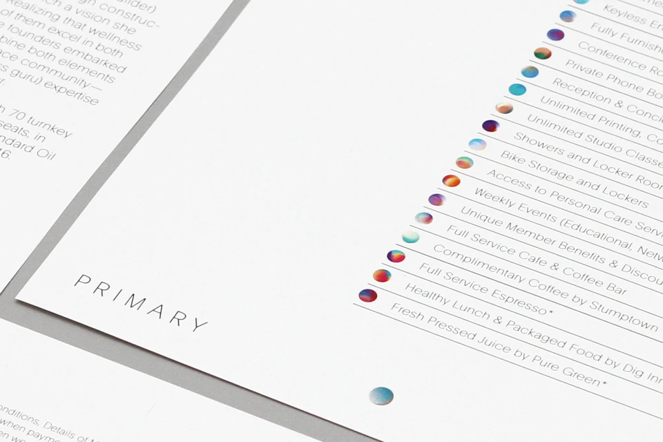
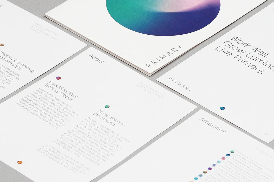
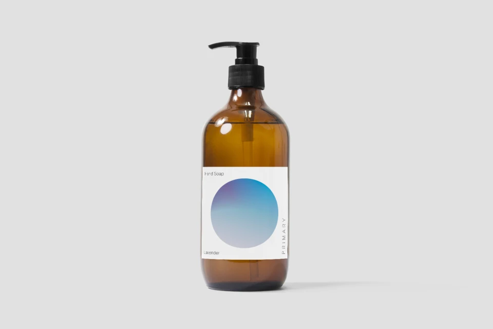
The brand identity for Primary represents a sophisticated masterclass in minimalist corporate design, masterfully bridging the gap between clinical efficiency and organic warmth. Developed by the team at DIA Studio, the visual system leans into a clean, restrained aesthetic that prioritizes negative space and precise typography, allowing for a highly functional yet memorable identity. The core of this visual language centers on vibrant, multi-colored circular gradients that provide a necessary kinetic energy against a neutral, white-dominant palette. Whether applied to matte business cards or the meticulously printed brochures, these vector graphics act as a rhythmic anchor, guiding the viewer through the collateral with subtle precision. The project extends beyond flat assets into the physical realm, where the brand is grounded by architectural interventions. In the reception area, the juxtaposition of lush green moss against sleek, backlit black lettering creates a welcoming tension, while the use of studio strobe lighting in product photography emphasizes the tactile quality of the amber glass soap dispensers. By harmonizing stark corporate geometry with soft, natural light and carefully curated textures, the identity system successfully transforms everyday office touchpoints into a cohesive, immersive brand experience. This work proves that when typography and graphic systems are stripped to their essentials, they achieve a timeless, professional resonance that feels both modern and inherently human.
Horizontal, Clean, Minimalist, Commercial
