
Bespoke
Brand Identity


Feb 2017
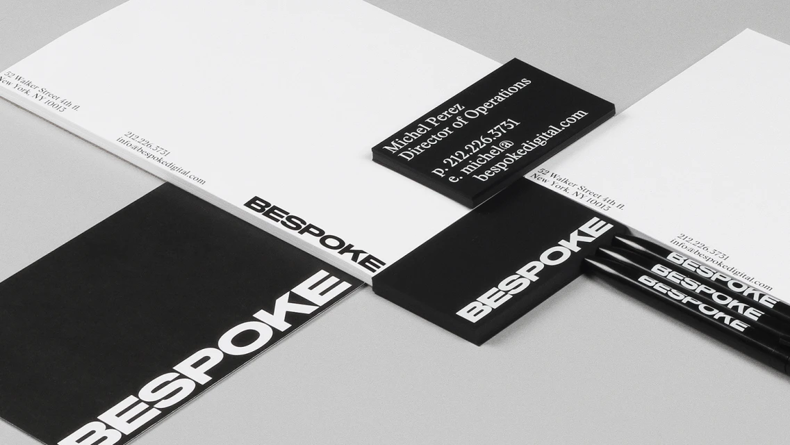
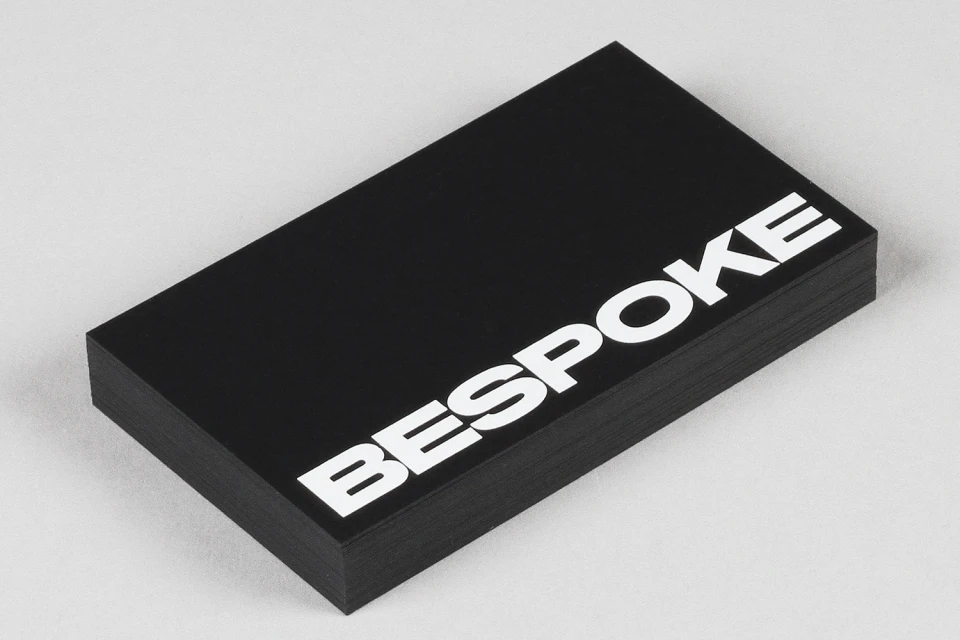
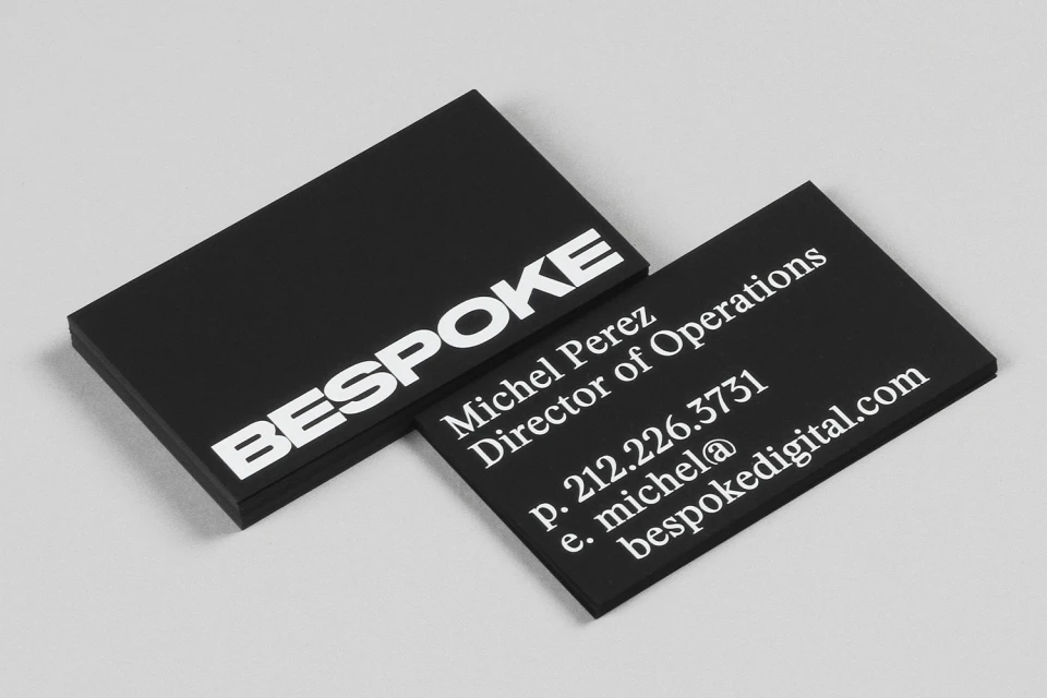
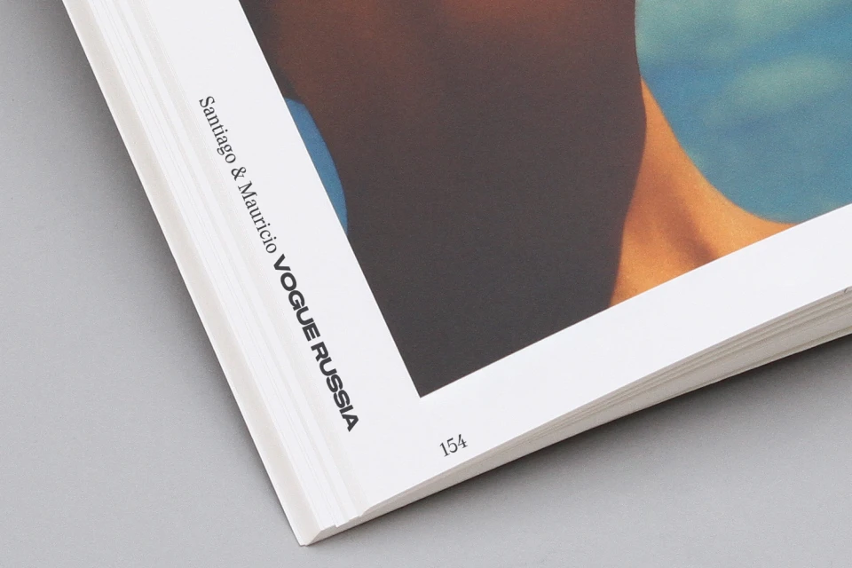
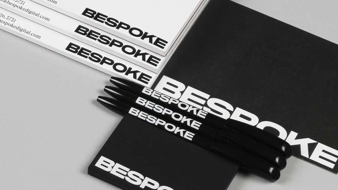
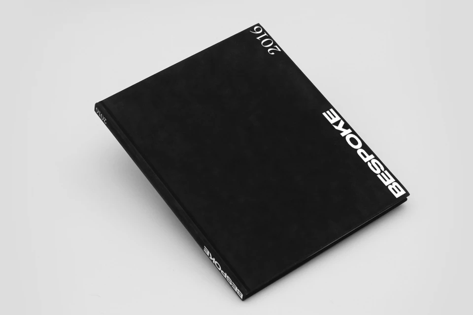
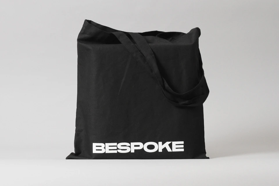
Bespoke defines its visual language through a rigorous application of editorial minimalism and high-contrast typography, asserting a presence that feels both timeless and aggressively contemporary. With graphic design led by DIA Studio, the project serves as a masterclass in corporate identity, where the brand name acts as a structural anchor across diverse collateral. The execution leverages studio strobe lighting and crisp, high-key commercial photography to transform standard stationery, such as thick-stock business cards and cotton tote bags, into tactile expressions of a premium aesthetic. By leaning into a stark monochrome palette, the design team creates a cohesive environment where bold sans-serif typefaces carry the primary narrative load. This is not merely stationery but a holistic visual system that maintains its precise, clean-lined integrity whether printed on a matte page or integrated into an editorial portrait. The work effectively bridges the gap between commercial clarity and high-end editorial flair, utilizing macro photography to highlight the physical texture of paper stock and the intentionality of every character placement. Through this lens, Bespoke emerges as a study in restraint, proving that when typography is treated with the same architectural rigor as a structural design element, the resulting brand identity speaks with unmatched authority and undeniable visual impact.
Horizontal, Commercial, Clean
Typography
Grey Seamless
