
Primary Brand Identity 2016
About
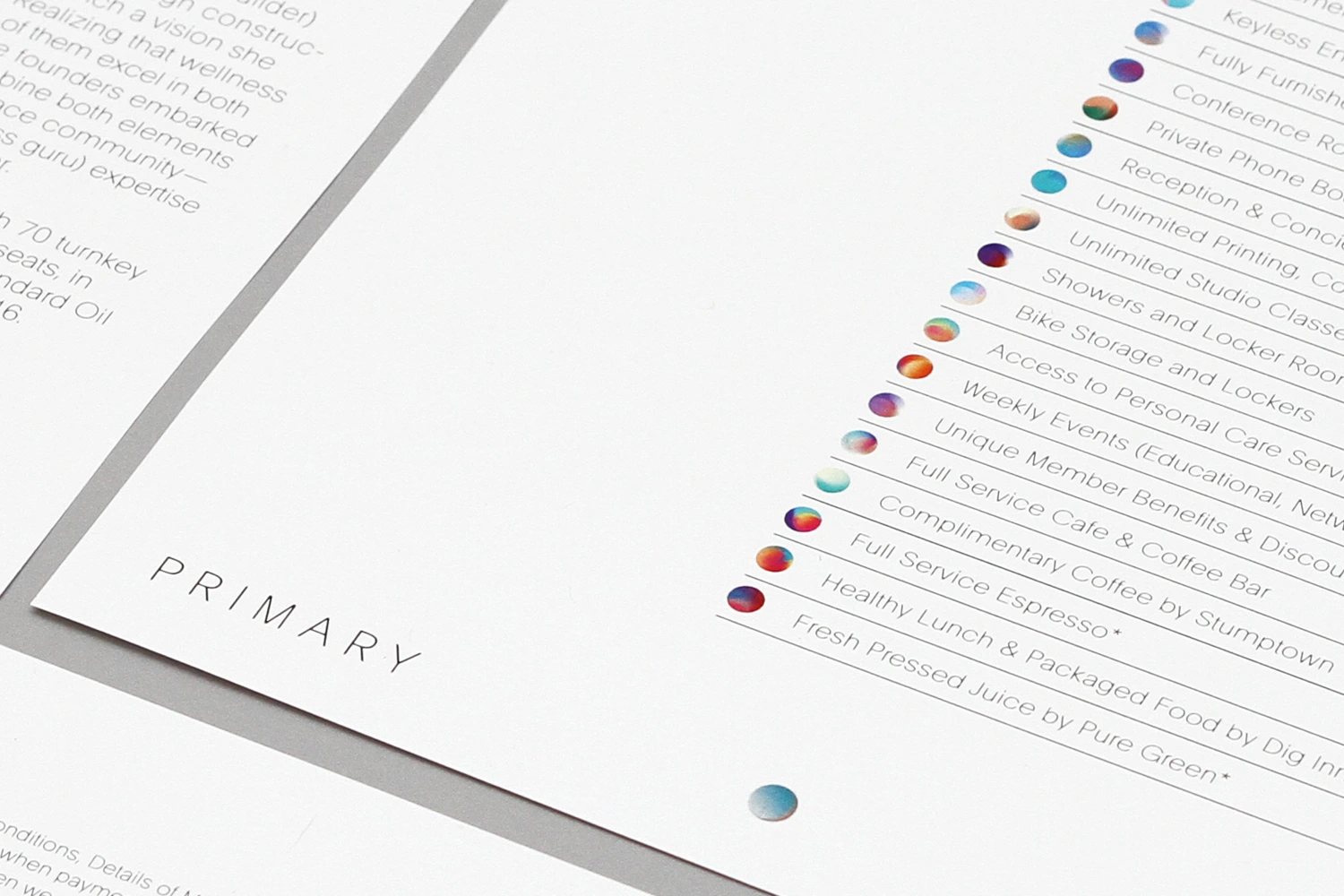
This graphic design project for Primary showcases a clean, minimalist corporate brand identity created by DIA Studio. The image features a crisp, white printed document angled on a neutral surface, displaying the word PRIMARY in elegant uppercase typography alongside structured lists of amenities. Each amenity line is paired with a distinct circular badge displaying a smooth gradient of blended colors. The composition utilizes sharp focus and clean editorial framing to highlight the precision of the typography and print production.
Brand
Project
Keywords
Credits
Styles
Techniques
Industries
Background
White Seamless
Context
Brand Film / Corporate Video