
Life or Death
Brand Identity
Oct 2015
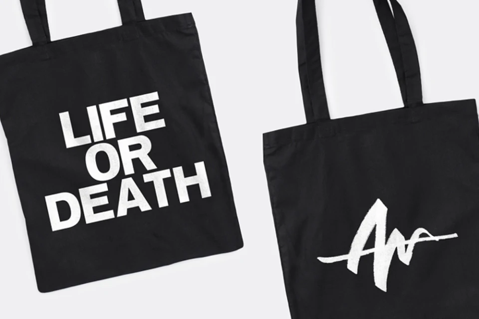
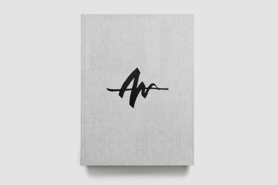
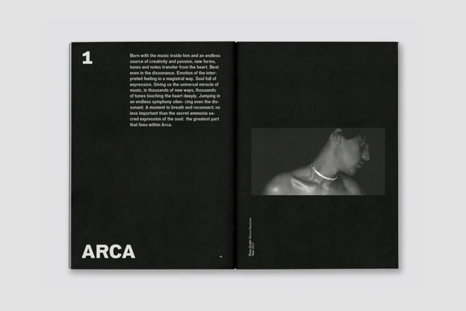
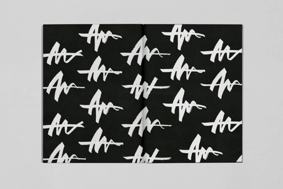
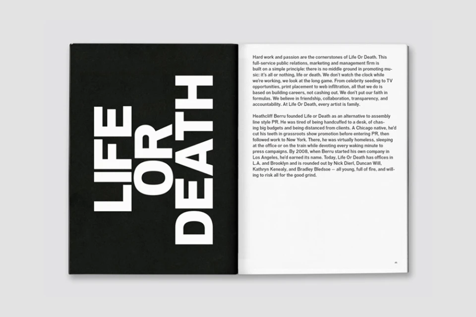
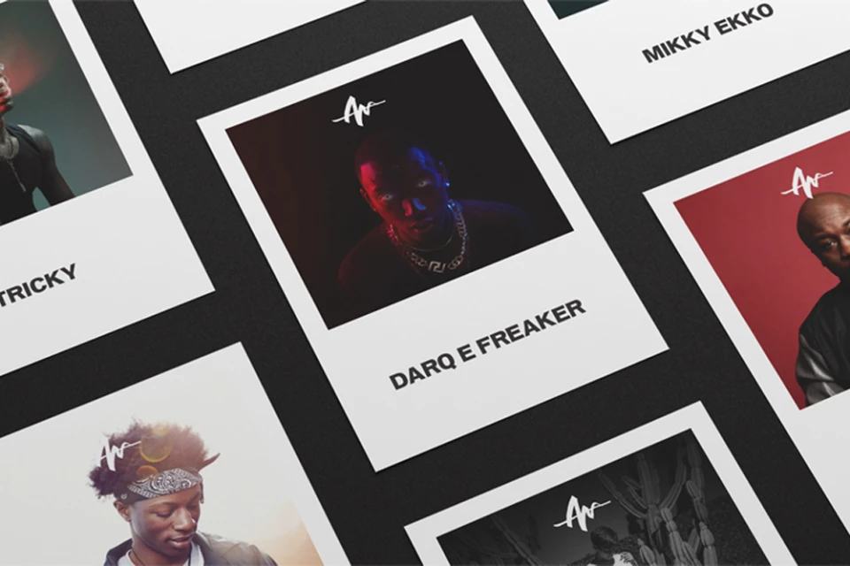
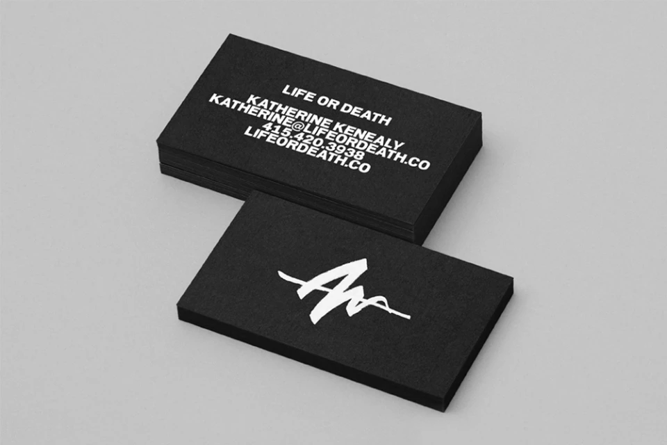
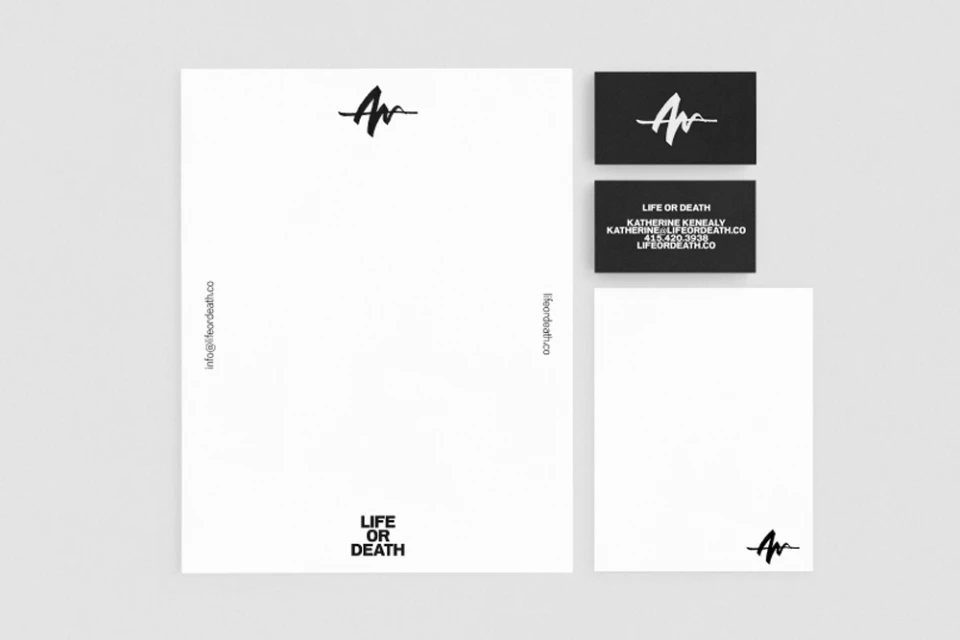
The brand identity for Life or Death emerges as a masterclass in editorial minimalism, stripping away the superfluous to establish a visual language rooted in stark contrast and structural precision. Spearheaded by the design experts at DIA Studio, the project leans into a monochrome palette, where the interplay between deep matte blacks and bright whites serves as the primary engine for communication. By leveraging studio strobe lighting, the collateral—ranging from clean tote bags and textured linen-bound books to professional stationery—captures a sense of tactile sophistication that feels both raw and curated. The typography acts as a central pillar of the brand, alternating between bold, authoritative sans-serif treatments and expressive, hand-painted brushstroke monograms that inject a necessary layer of human artistry into an otherwise industrial grid. This project masterfully navigates the intersection of commercial utility and high-end editorial flair, utilizing precise geometric spacing and clear, consistent iconography to build a robust system of visual storytelling. Whether through the arrangement of grid-based portraiture or the sharp, high-contrast layouts of its printed spreads, Life or Death communicates a singular, focused vision. The resulting aesthetic feels intentional and elevated, proving that when handled with typographic rigour, a limited color scheme can define a brand with as much authority as any complex visual campaign.
Clean, Minimalist, Horizontal
Typography
