
Postevand: Brand Identity




Mar 2020
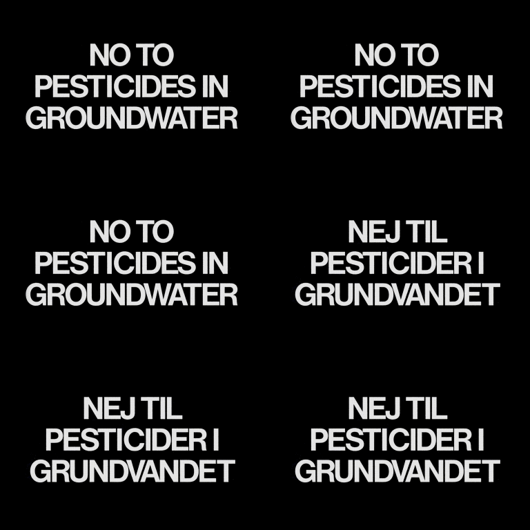
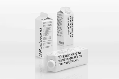
Postevand has redefined the visual language of sustainability through a compelling brand identity that merges rigorous environmental advocacy with a distinct, minimalist aesthetic. By leaning into editorial minimalism, the project elevates the humble water carton into a platform for civic consciousness, utilizing bold, high-contrast typography to center the narrative on the critical issue of groundwater protection. The brand’s identity is built upon a dual-track strategy: one that is starkly informational, featuring vector-based graphics and multilingual messaging that reads as a manifesto, and another that is grounded in authentic, lifestyle-led documentary photography. The execution by the team at Barkas seamlessly blends these worlds, juxtaposing clinical, high-key studio packshots against soft, natural-light shots of subjects in wild, unrefined landscapes. Through the clever use of CGI and 3D rendering, the cartons appear weightless and iconic against clear blue skies, creating a visual tension between the commercial product and its message of ecological responsibility. This identity system avoids the traps of conventional green-washing, instead opting for a clean, modern design vernacular that feels both urgent and timeless. Whether through the directness of their sans-serif layouts or the candid portrayal of their advocacy in field-based settings, the project demonstrates how deliberate graphic design can turn a utilitarian object into a powerful vehicle for social and environmental change.
Horizontal, Commercial, Minimalist
Advertising Campaign
