
Portoro: Brand Identity
Brand
Date
May 2024
Description
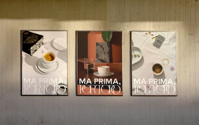
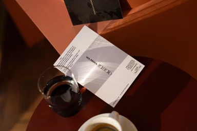
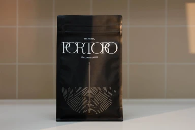
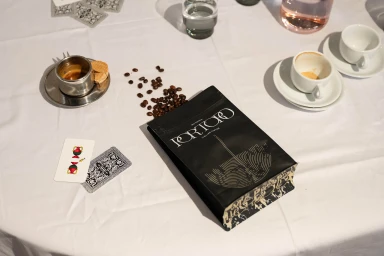
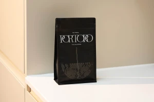
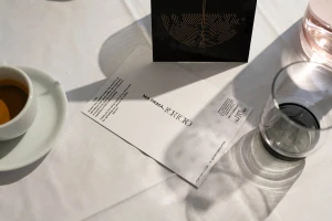
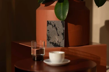
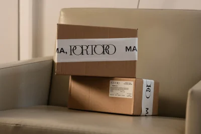
Portoro’s brand identity project establishes a minimalist and refined presence within the food and beverage industry. Through a cohesive visual system, the work utilizes clean typography and a muted color palette to highlight product packaging and collateral. Captured by photographer Tian Khee Siong with graphic design by IYA Studio, the project incorporates natural light and warm, textured surfaces to build a distinct editorial atmosphere. The execution spans still-life product photography and motion design, employing a clean, minimalist style to showcase coffee blends, shipping materials, and printed brand cards.
Style
Horizontal, Commercial, Warm, Clean
Techniques
Natural light
Industries
Color
Pure White
Associated creatives


5000+ creatives to discover
Sign up to gain access to the entire directory. It’s free.
Visie is a curated library of creative professionals.