
House of Cans: Brand Identity



Jun 2021
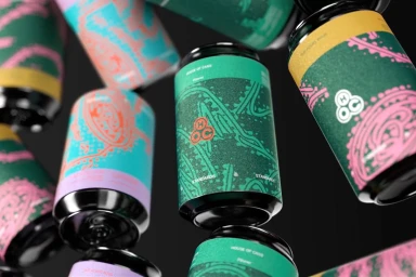
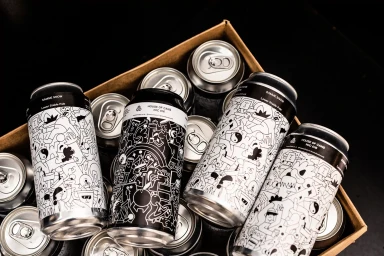
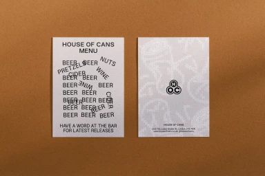
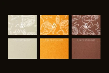
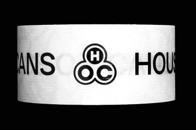
House of Cans presents a comprehensive brand identity project centered on its beverage packaging and collateral. Developed by IYA Studio, the identity leans into a versatile graphic language that features detailed line-art illustrations, whimsical character motifs, and a cohesive, earth-toned color palette. The visual presentation, captured by photographer Jonathan Donovan, utilizes clean studio lighting and macro compositions to highlight tactile paper finishes and metallic surfaces. Through the application of bold typography and consistent logo placement, the design extends across diverse brand touchpoints, including beverage cans, product boxes, menu cards, and minimalist stationery.
Horizontal, Commercial, Clean
Advertising Campaign

