
Porto City Theatre: Brand Identity
Oct 2019
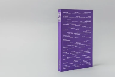
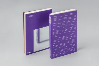
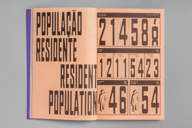
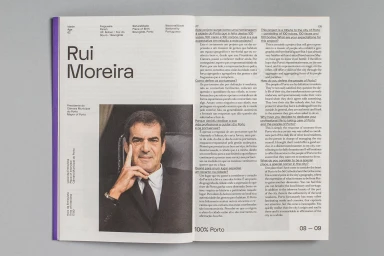
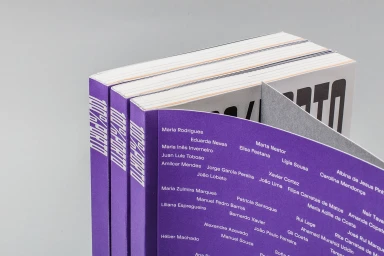
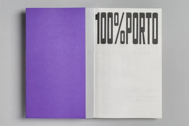
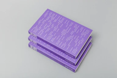
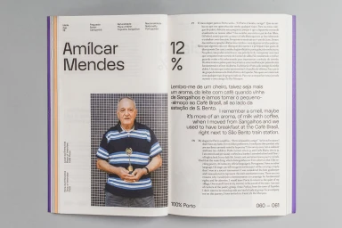
The brand identity project for the Porto City Theatre serves as a masterclass in typographic discipline and editorial rigor. Led by graphic designer Oscar Maia, the visual system leans into a sophisticated, minimalist aesthetic that transforms the institution’s identity into a cohesive physical experience. Centered on the publication 100% PORTO, the design utilizes a striking palette of deep violet and neutral grey to anchor its heavy reliance on structured grid-based typography. Each spread acts as a testament to the power of clean information design, seamlessly balancing dense lists of names with high-contrast portrait photography and detailed infographics. The application of silver-foiled accents and bold, sans-serif letterforms reinforces a modern, corporate sensibility while maintaining an artistic edge. By utilizing stark color blocking and precise alignment, the identity avoids the clutter of conventional media collateral, instead opting for a clinical yet deeply impactful presentation. Whether through the bilingual interview layouts featuring local figures or the rhythm of the repeated naming grids, the design feels intentional and sharp. This project successfully establishes a professional visual language that feels as much like an archival document as it does a contemporary brand guide, emphasizing clarity through a refined, grid-centric approach to corporate communication that resonates across both print and digital media landscapes.
Horizontal, Commercial, Clean, Minimalist
Typography
Grey Seamless
Editorial
