
Brand
ProjectBrand Identity
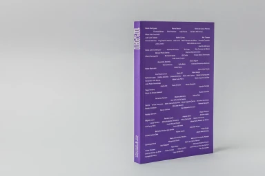
Porto City Theatre Brand Identity 2019
Associated creatives

Tags
Description
This studio photograph showcases a purple book standing upright against a clean, neutral grey backdrop. The front cover features clean white typography arranged in a typographic layout with numerous names and the title text running vertically along the spine. The lighting is soft and even, casting subtle shadows to the left and emphasizing the clean edges of the book object. The graphic design project was created by Oscar Maia for the Porto City Theatre brand identity.