
Brand
ProjectBrand Identity
Porto City Theatre Brand Identity 2019
Associated creatives

Tags
Description
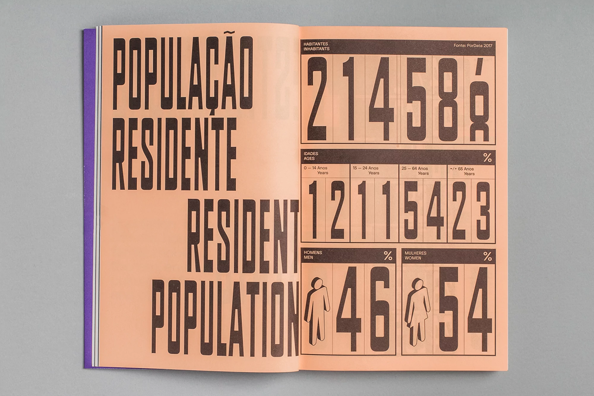
This graphic design spread for the Porto City Theatre brand identity project features bold, condensed sans-serif typography across peach-coloured pages. The left page displays bilingual text in Portuguese and English reading 'POPULAÇÃO RESIDENTE' and 'RESIDENT POPULATION'. The right page presents statistical data layouts with large numbers and percentage figures alongside simplified icons representing men and women. The publication is captured flat on a neutral grey background, highlighting its clean graphic layout and editorial quality.
Style
Editorial, Horizontal, Clean, Minimalist
Techniques
Typography, Data visualisation
Industries
Digital Media & Publishers
Color
Terracotta (70%)
Jet Black (30%)
Background
Grey Seamless
Context
Editorial