
ProjectBrand Identity
Brand Identity 2019
Associated creatives

Tags
Description
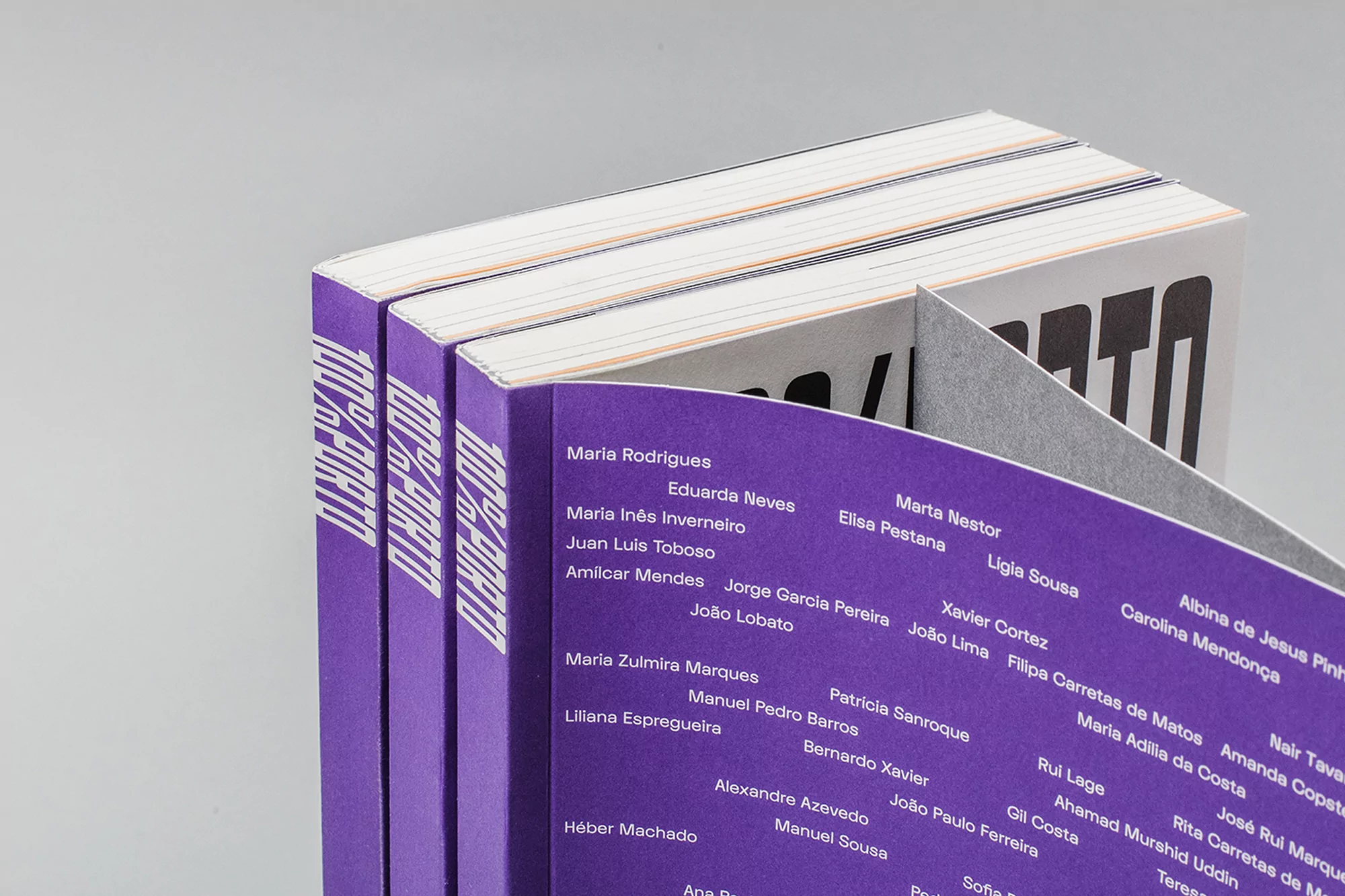
Graphic design brand identity project for Porto City Theatre created by Oscar Maia. Three bound publications are arranged at an angle against a neutral grey studio surface. The spines are rendered in a vibrant purple hue featuring bold white typography reading 100 por cento porto, while interior pages display neatly typeset names. The composition uses clean lighting and a minimalist setup to highlight the publication design and editorial layout.
Style
Horizontal, Commercial, Clean, Minimalist
Industries
Digital Media & Publishers
Color
Plum (50%)
Pure White (50%)
Background
White Seamless
Context
Advertising Campaign