
Pirate: Brand Identity
Feb 2021
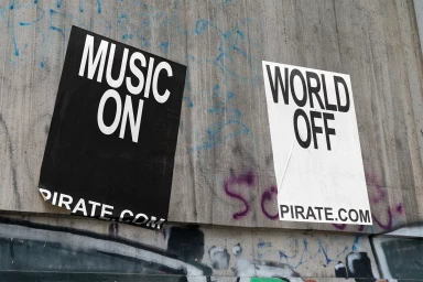
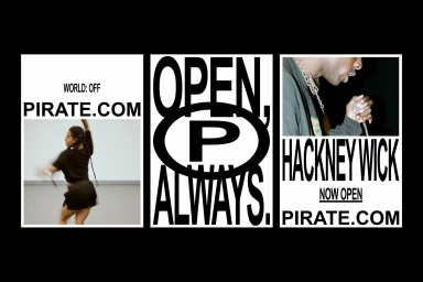
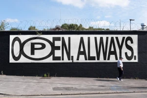
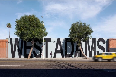
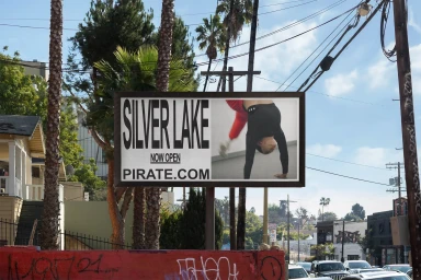
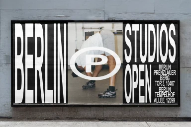
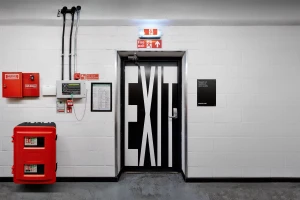
The brand identity for Pirate communicates its expansion into new urban markets through a high-contrast graphic system. Developed by Only, the design language centers on bold, monochromatic typography that integrates directly into physical environments, from wheat-pasted posters in Hackney to large-scale billboards in Los Angeles and Berlin. The visual strategy leans into a raw, industrial aesthetic that prioritizes clarity and scale. The project incorporates photography by Marcus Ginns, which documents the brand's presence in diverse cityscapes. These images utilize natural light and analogue film techniques to capture the studio spaces and local signage. By blending clean graphic elements with documentary-style imagery, the identity emphasizes the brand's role as a functional, accessible space for creators.
Horizontal, Clean, Commercial
Street
Advertising Campaign, Out of Home (OOH)

