
Parafin: Brand Identity




Brand
Date
Jul 2023
Description
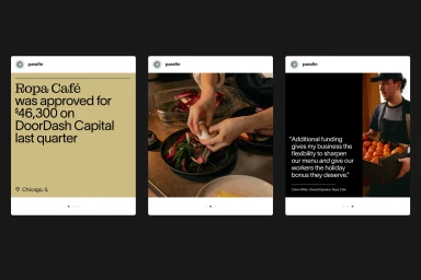
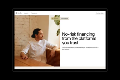
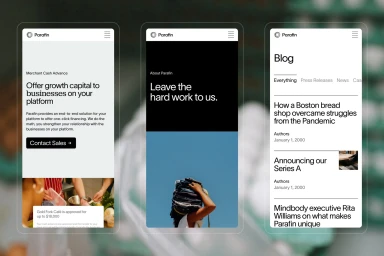
Parafin’s comprehensive brand identity project establishes a visual language centered on minimalist principles and professional clarity. The design system, crafted by XXIX and Ty Wilkins, integrates a versatile typographic hierarchy using Lausanne and Montagu Slab alongside a functional, muted color palette. Across a diverse range of deliverables—including digital platform UI, outdoor billboards, and motion graphics—the identity leans into a clean, modern aesthetic. By pairing precise geometric iconography with editorial photography that captures authentic commercial and office environments, the work effectively translates complex financial funding concepts into accessible corporate communication.
Style
Clean, Commercial, Horizontal
Color
Jet Black
Associated creatives


5000+ creatives to discover
Sign up to gain access to the entire directory. It’s free.
Visie is a curated library of creative professionals.