
Papa San: Brand Identity

Aug 2025
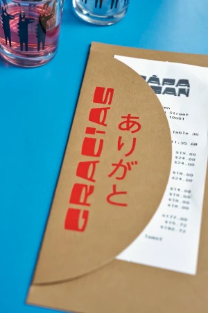
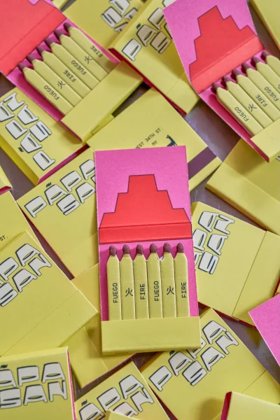
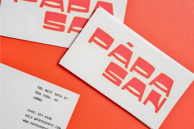
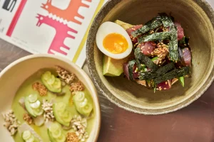
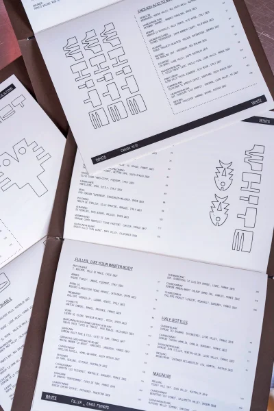
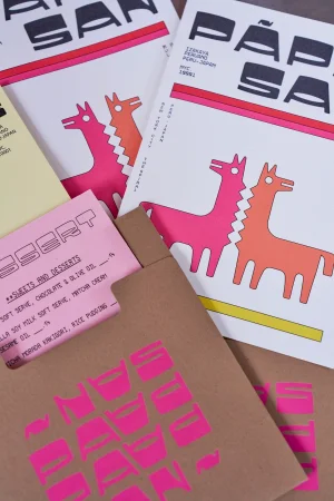
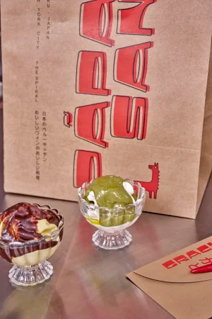
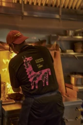
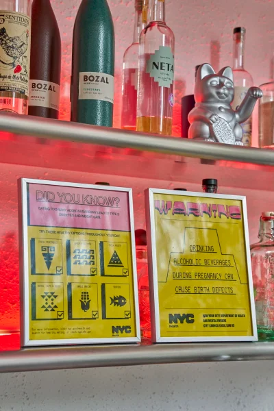
Papa San’s brand identity project establishes a visual language centered on bold typography and a vibrant primary color palette. Developed by graphic design studio Polonsky & Friends, the system integrates custom paper goods, tactile packaging, and minimalist graphic elements to define the brand’s culinary presence. Captured by photographer Giada Paoloni, the visual assets lean into a clean, commercial aesthetic that contrasts graphic print work with earthy, raw culinary photography. The project highlights a consistent application of design across menus, stationery, and bespoke packaging, while integrating a moodier, candid approach for kitchen and interior environment shots that utilize warm, natural light and deep shadows.
Vertical, Commercial, Clean
Advertising Campaign

