
Ants Coffee
Brand Identity
Aug 2026
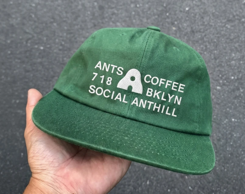
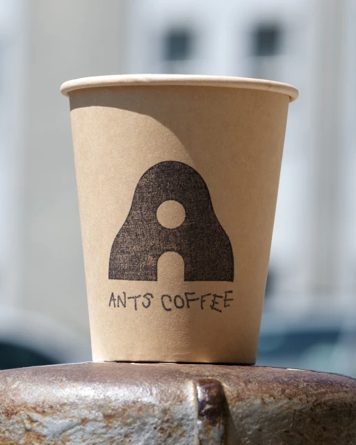
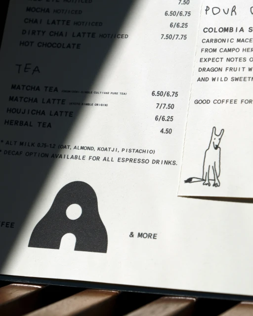
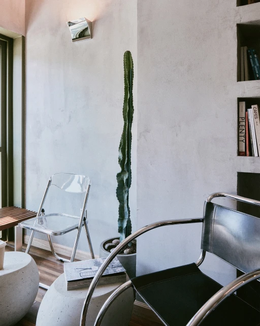
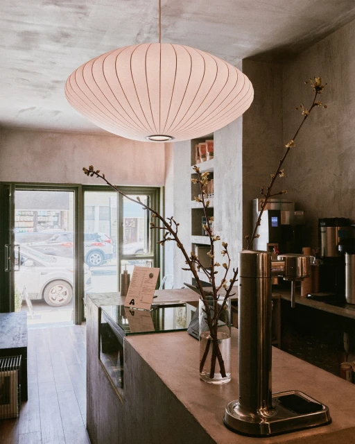
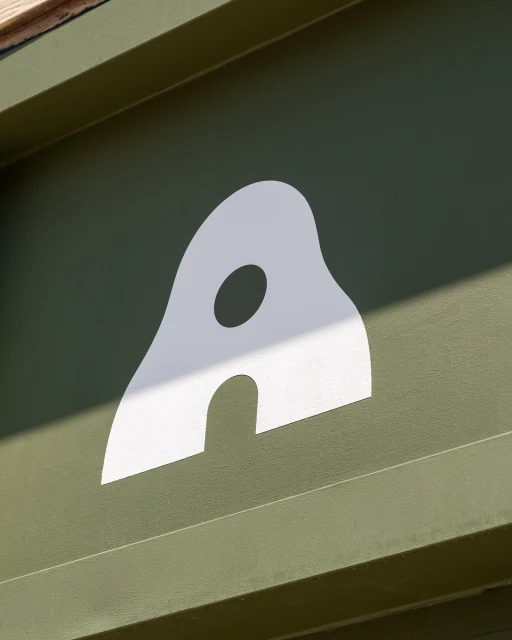
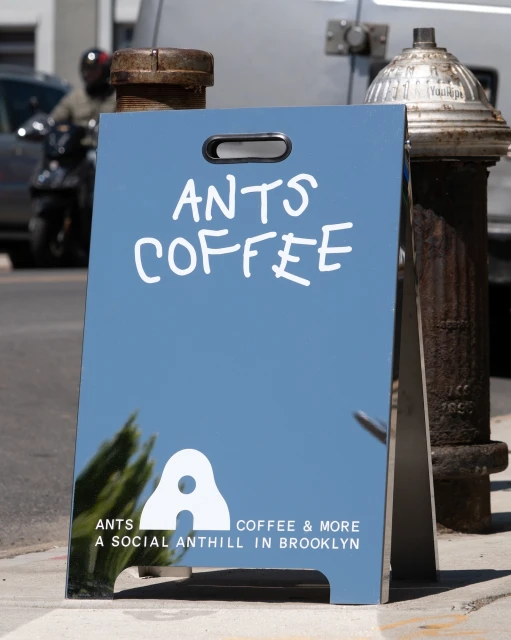
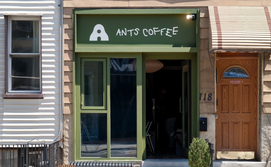
Ants Coffee establishes a distinct presence in the local food and beverage scene through a meticulously crafted brand identity that balances industrial edge with organic warmth. Conceptualized by Tuman Studio, the brand leans into a minimalist aesthetic, utilizing a restrained palette of muted olive greens, natural beiges, and sharp, graphic blacks. This visual language is consistently applied across a diverse range of touchpoints, from the tactile texture of cotton twill apparel and matte paper packaging to the clean, modern typography found on menu design and environmental signage. The execution effectively channels a neighborhood-centric ethos, characterized by a stylized logo that functions as a structural motif throughout the physical space. Within the cafe interior, Tuman Studio integrates raw material finishes—such as concrete counters, chrome-framed leather seating, and organic branch arrangements—to create an atmosphere that feels both curated and inviting. By emphasizing natural light in its commercial photography, the brand highlights the interplay between its geometric design elements and the layered, urban surroundings of its Brooklyn home. Whether manifesting in a bold A-frame sidewalk sign or the subtle, high-contrast embroidery of a baseball cap, the identity functions as a cohesive system. The result is a sophisticated, approachable brand presence that transforms a local coffee shop into a recognizable social anthill, where every architectural detail and graphic choice feels intentional and grounded.
Commercial, Vertical, Minimalist, Clean
Natural light
Beverages
